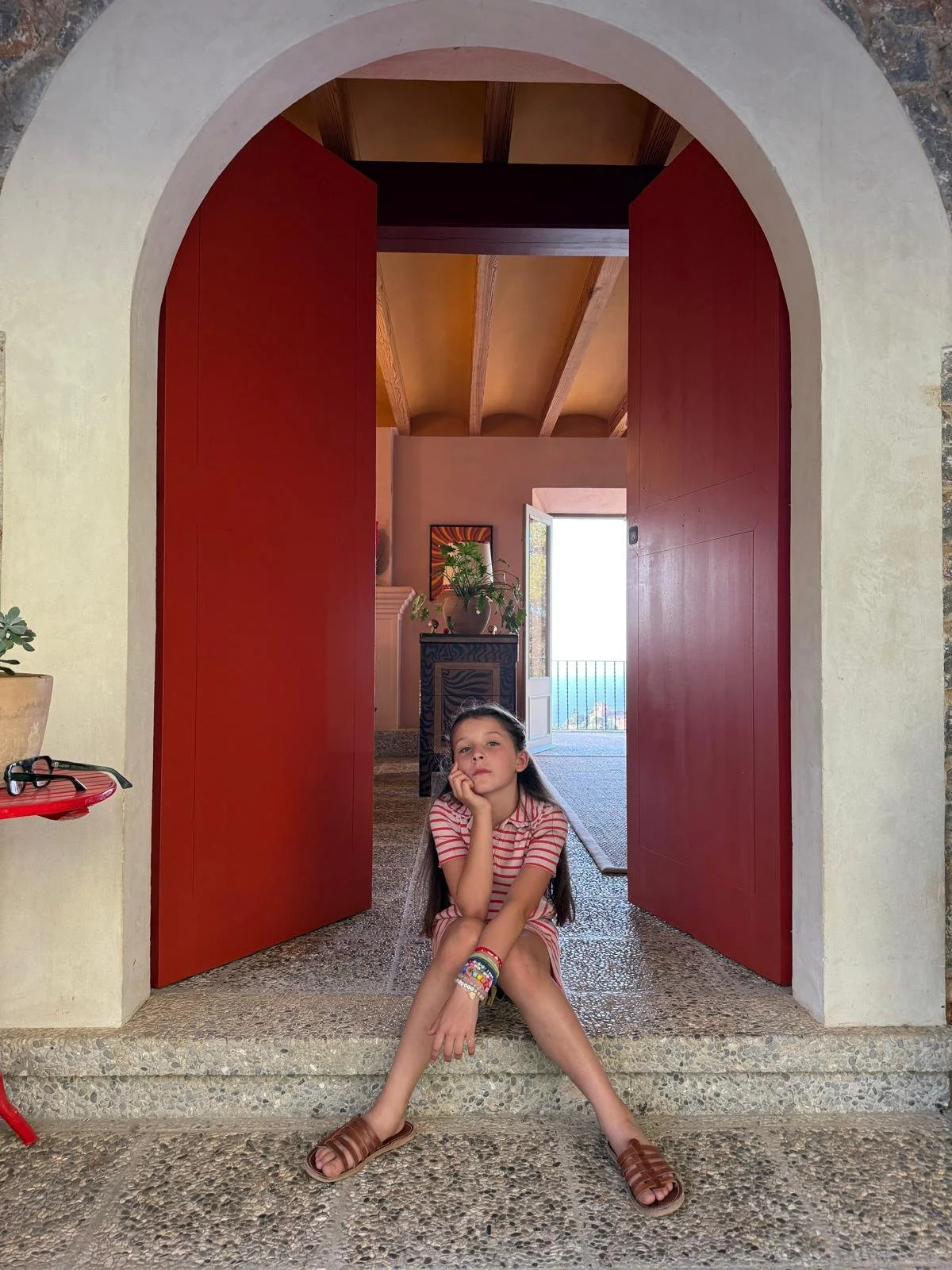
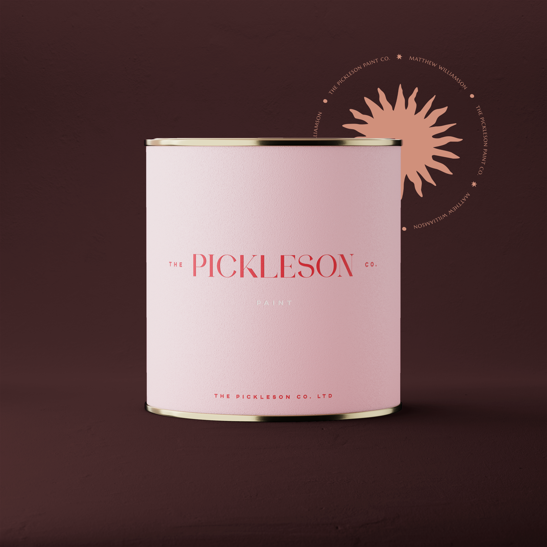
Matthew Williamson x Pickleson
The Brand new 16 colour collection is now Available exclusively at pickleson.com
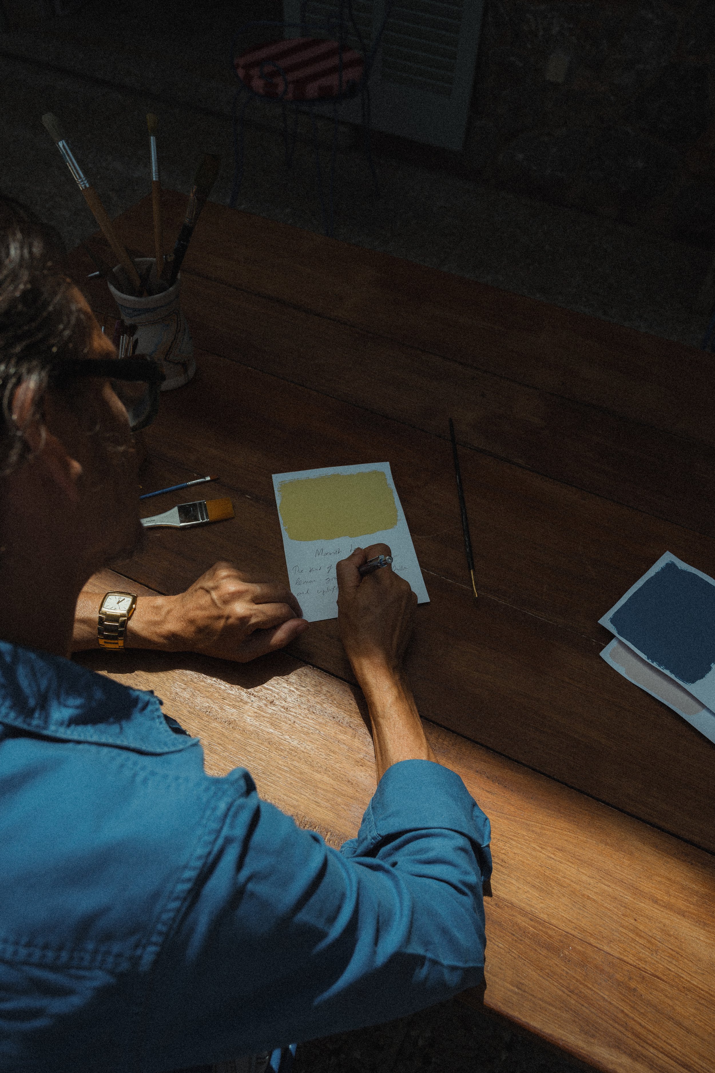
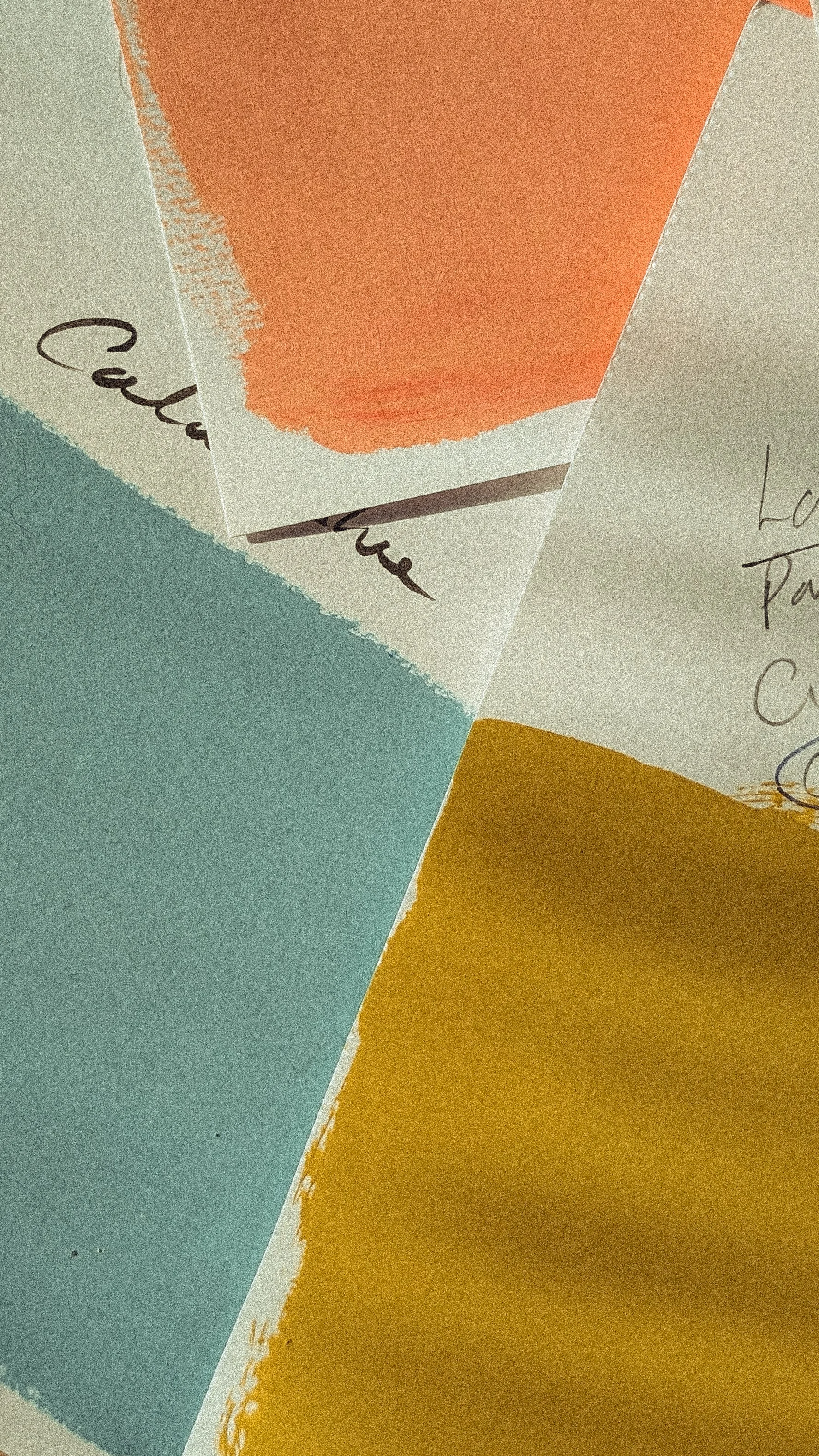
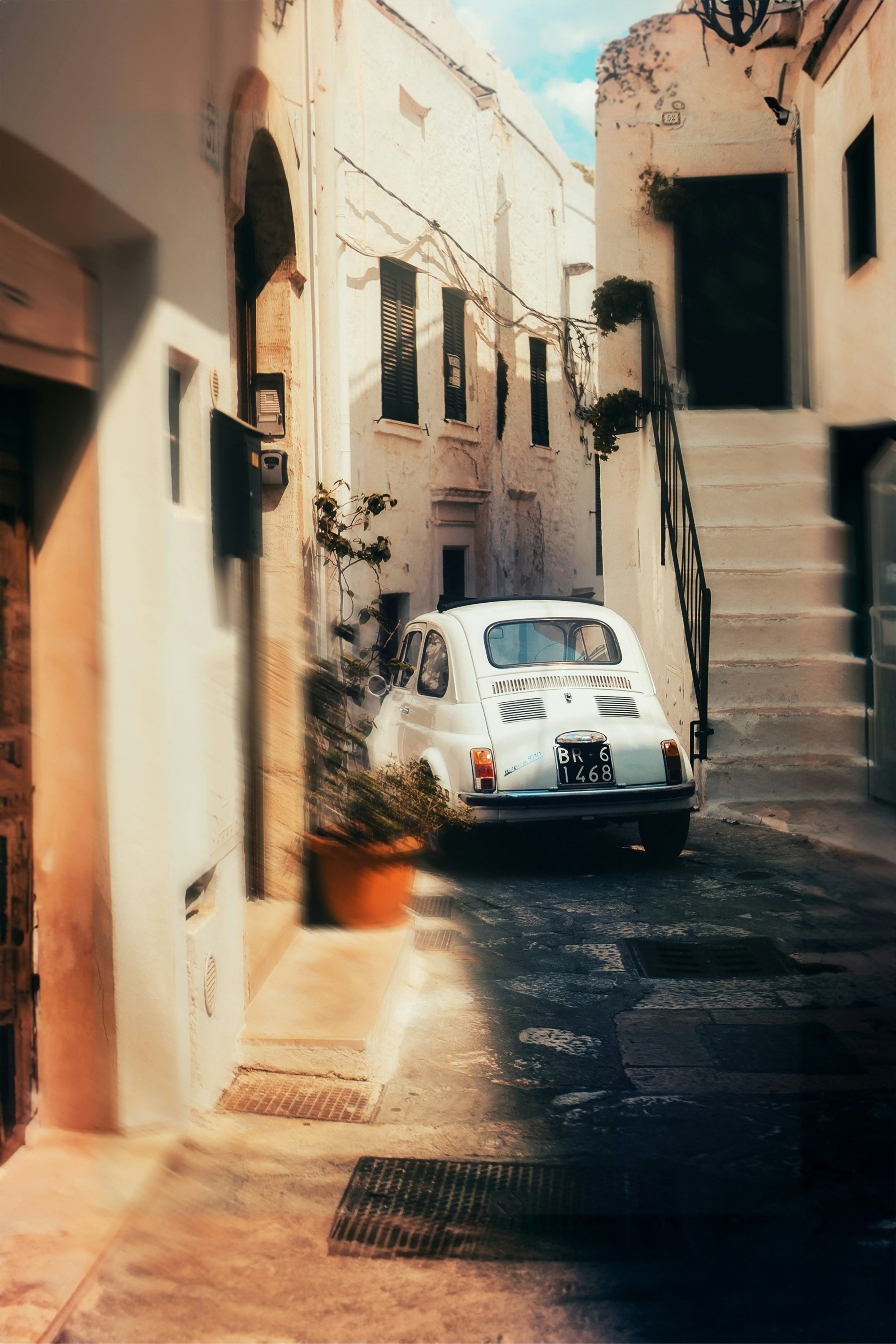
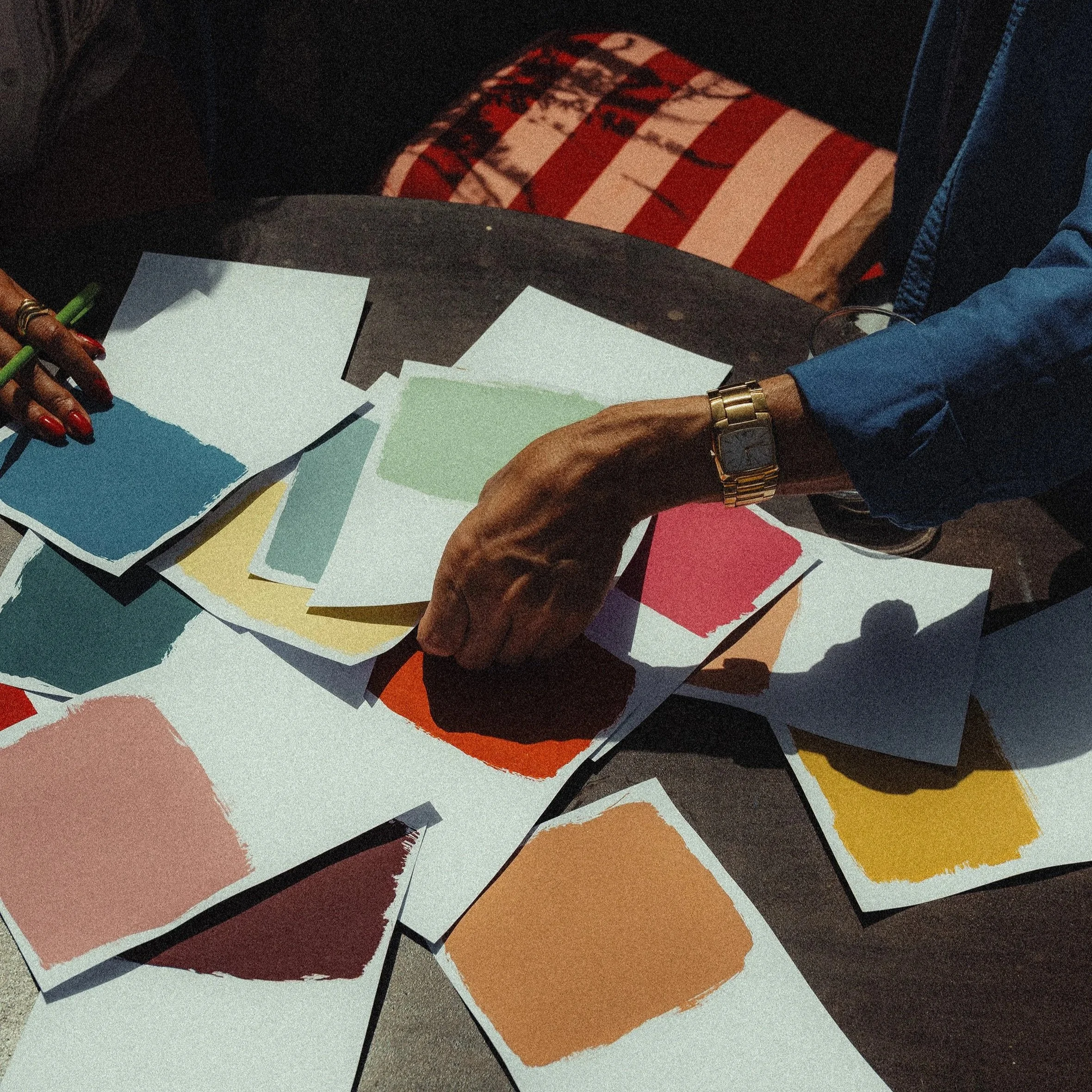
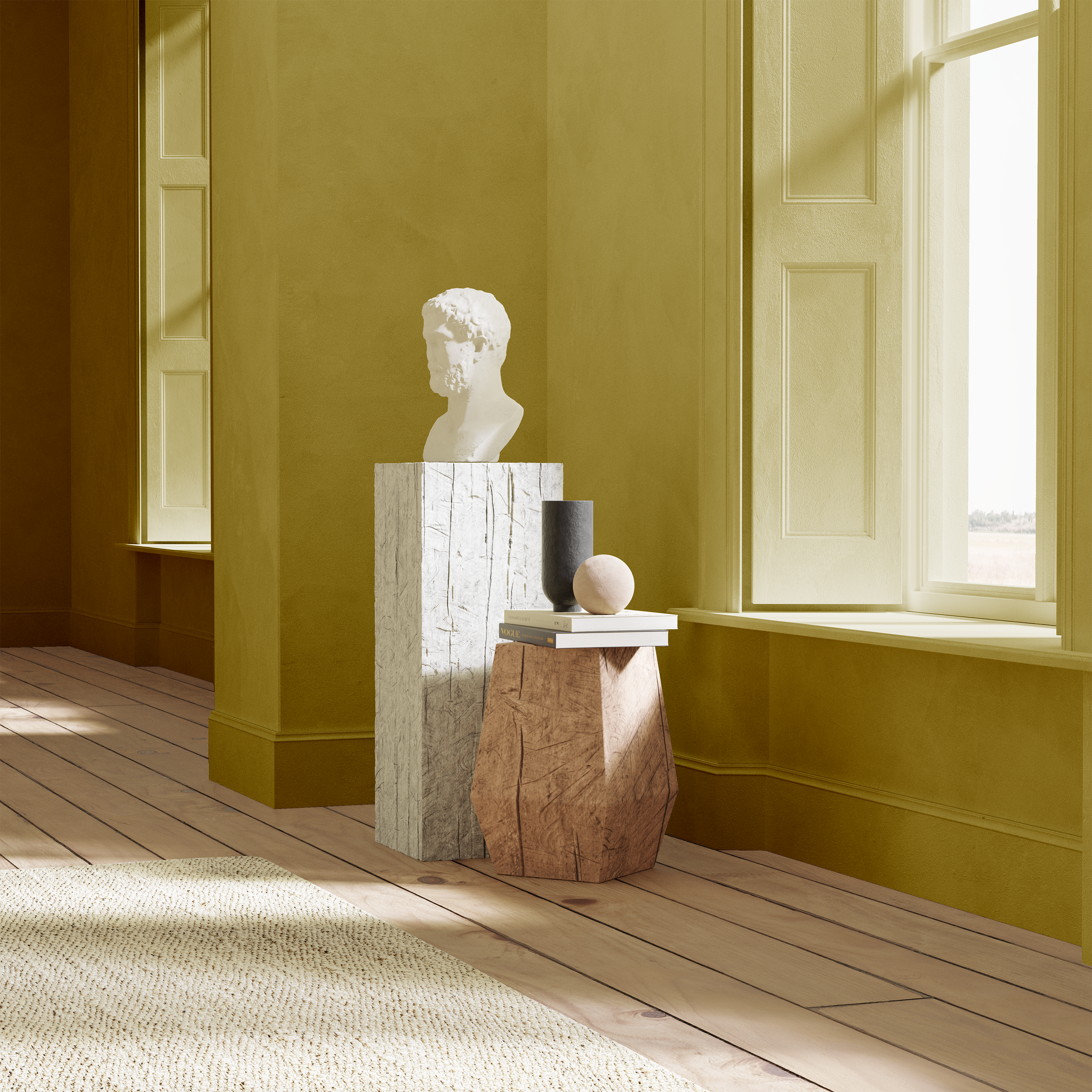
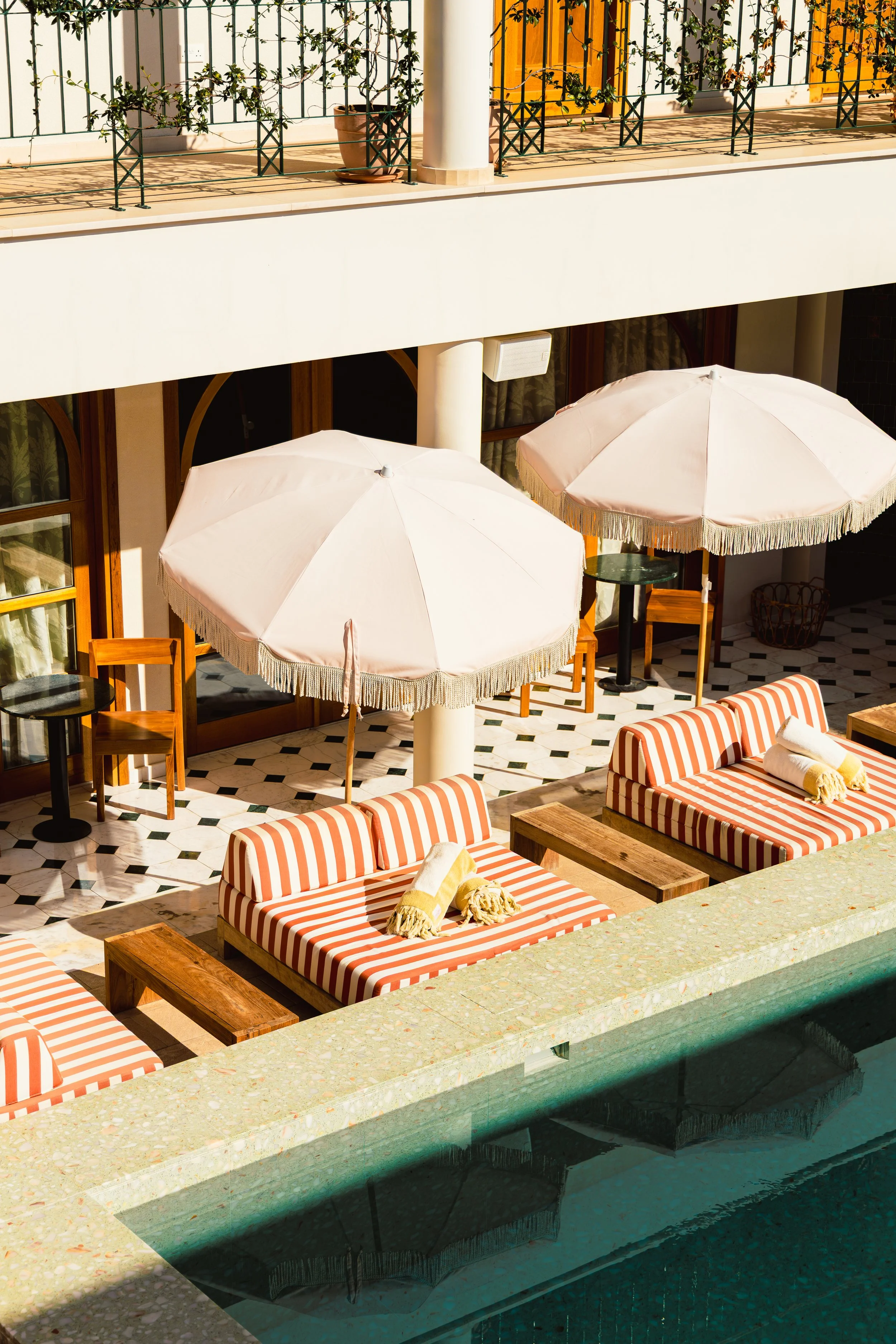
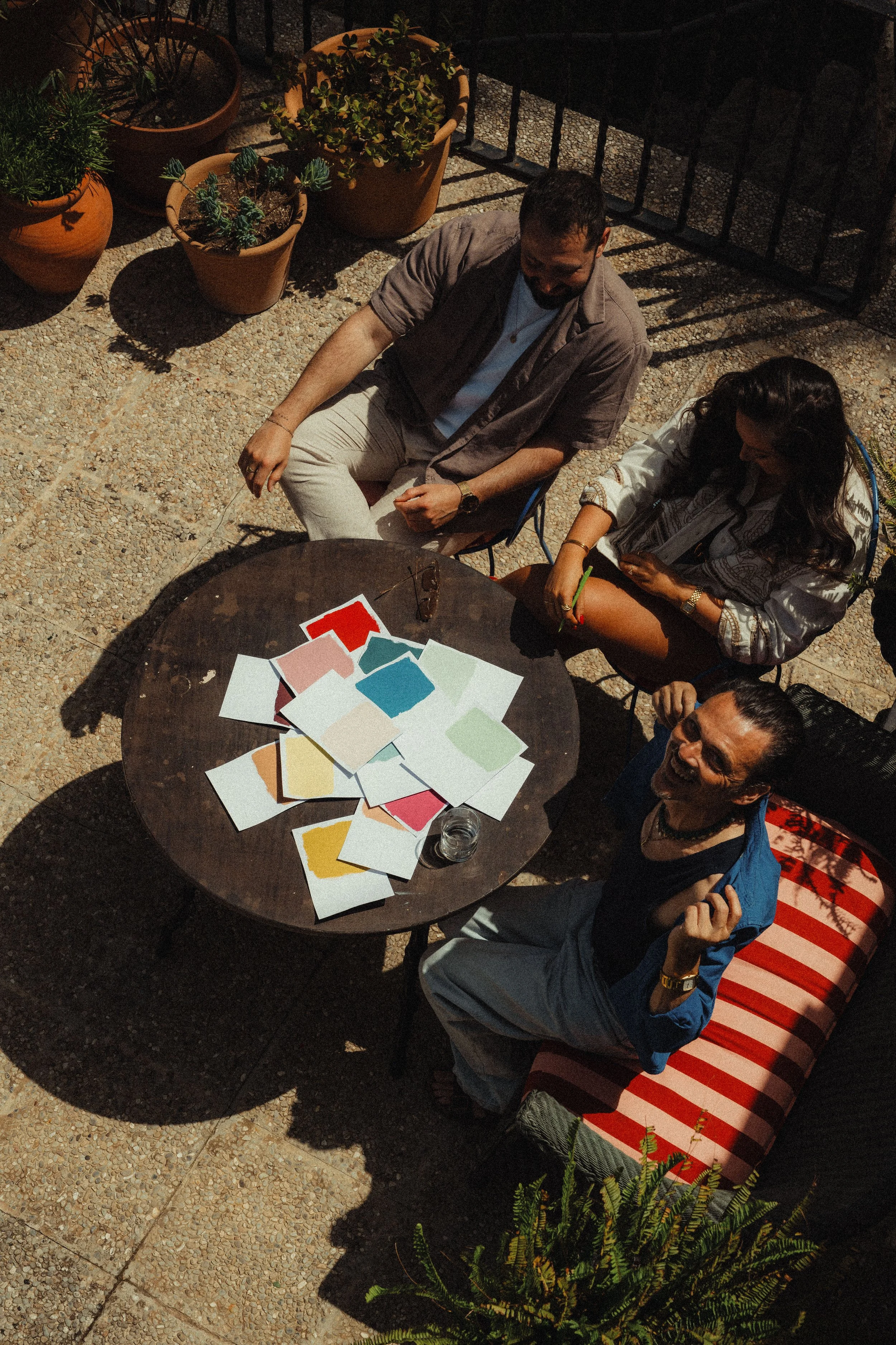
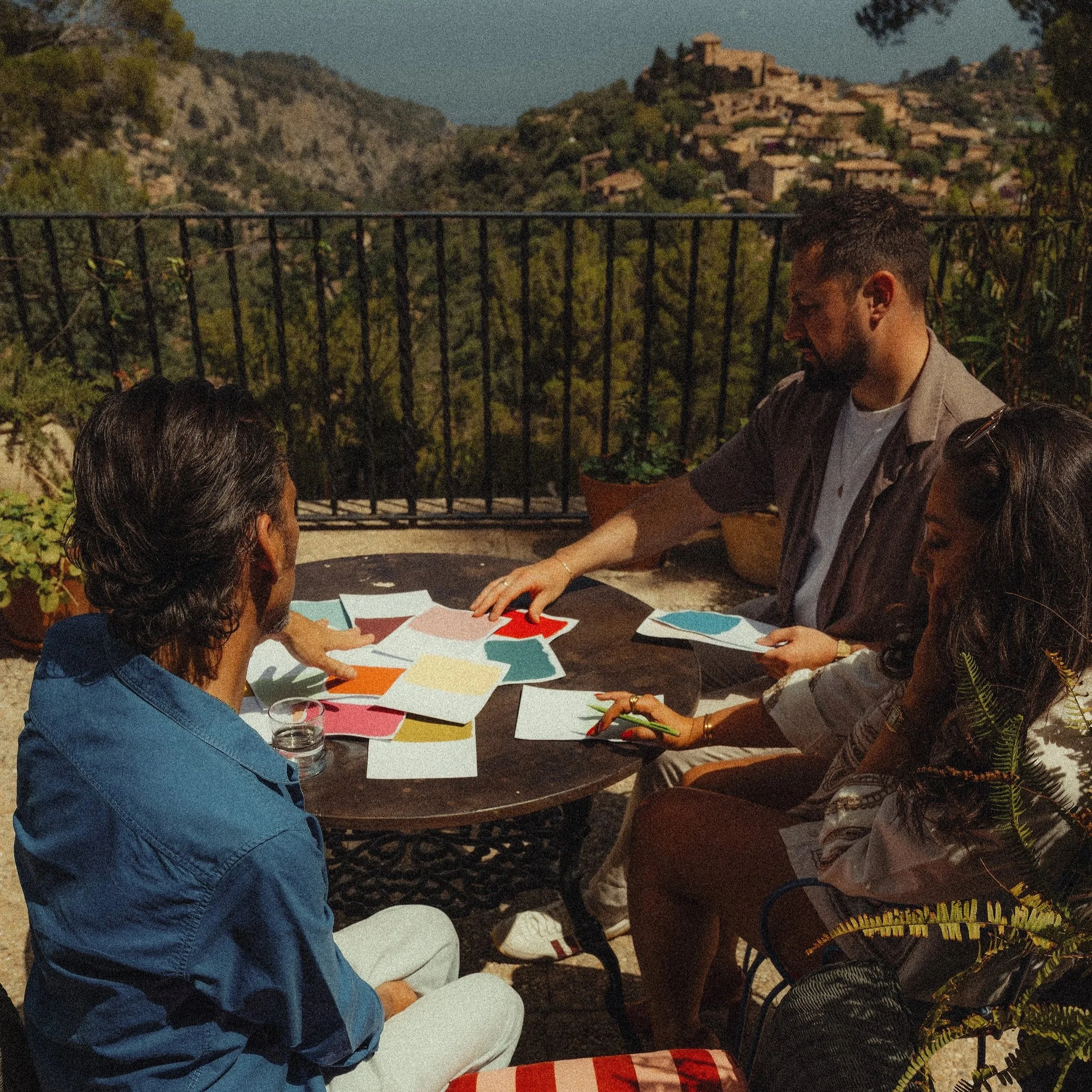
Paint: Cala Blue & Old Brass by Matthew Williamson & The Pickleson Paint Co. | Photography: Andrea Pomelli
The term “icon” is thrown around quite a lot these days…
…But in the case of Matthew Williamson, we’d argue it's entirely deserved.
For decades, he has shaped the way we think about colour. From defining an era in fashion with his fearless use of print and palette, to creating interiors that feel layered, sun-drenched and unmistakably his, Matthew has always understood how colour can transform not just a space, but the way you feel within it.
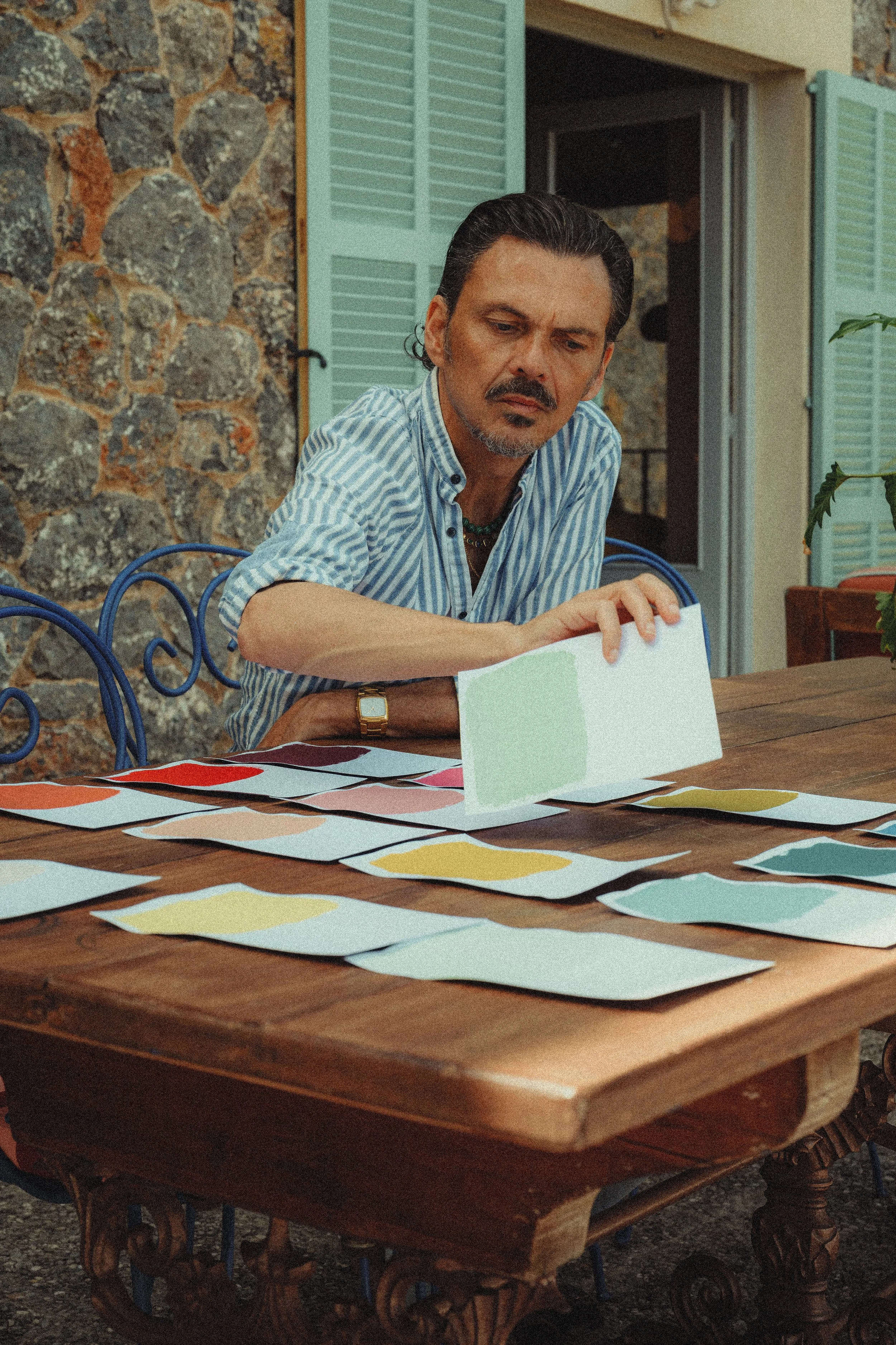
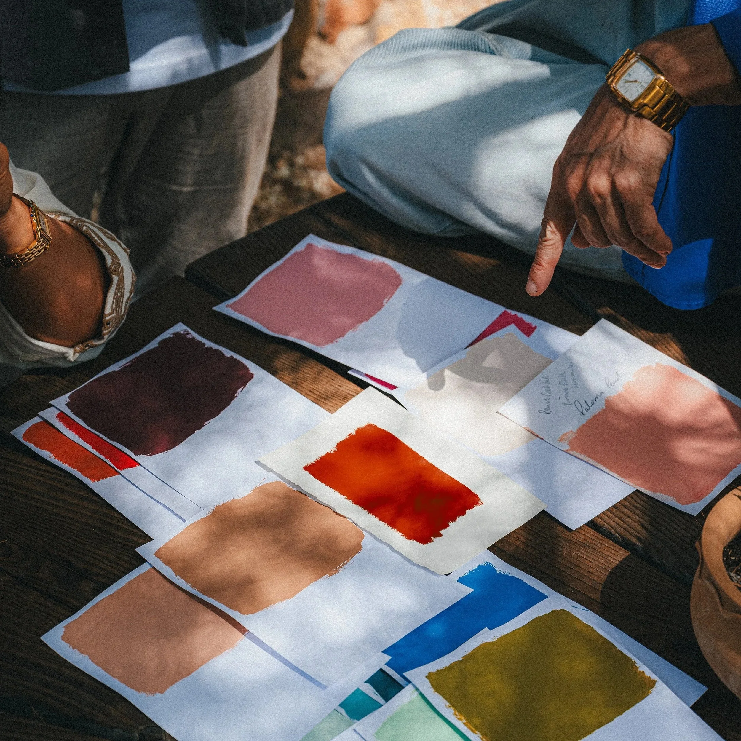
Built on a shared love of colour and refined over several bottles of Cava, this collection is the result of an ongoing conversation. One that has been shaped by decades of experience, instinct, memory, travel and a shared belief in creating spaces that feel as good as they look.
The result is a collection of sixteen brand new shades. Each with their own story, but all designed to be lived with, layered and returned to over time.
We hope you love them...
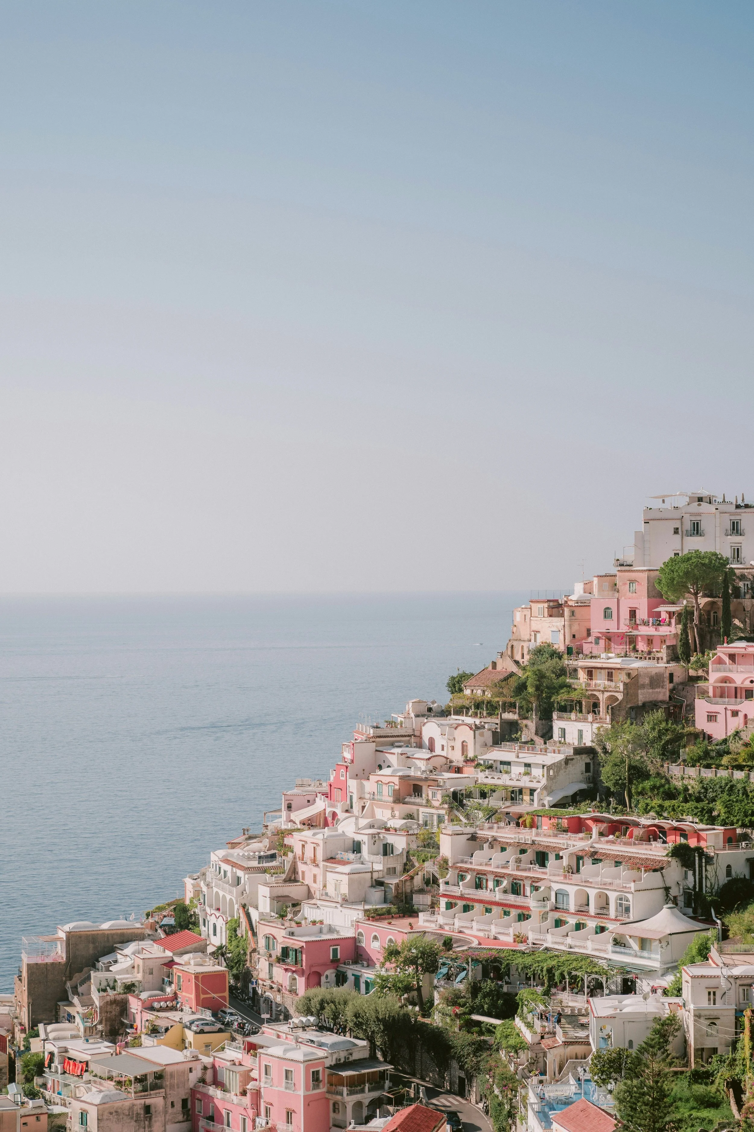
Aphrodite Orange
Deeper than orange and warmer than terracotta, this shade smoulders in the sunshine and mellows effortlessly by lamplight.
Just like its namesake, it carries a touch of the divine. All warmth, allure and sun-drenched confidence.
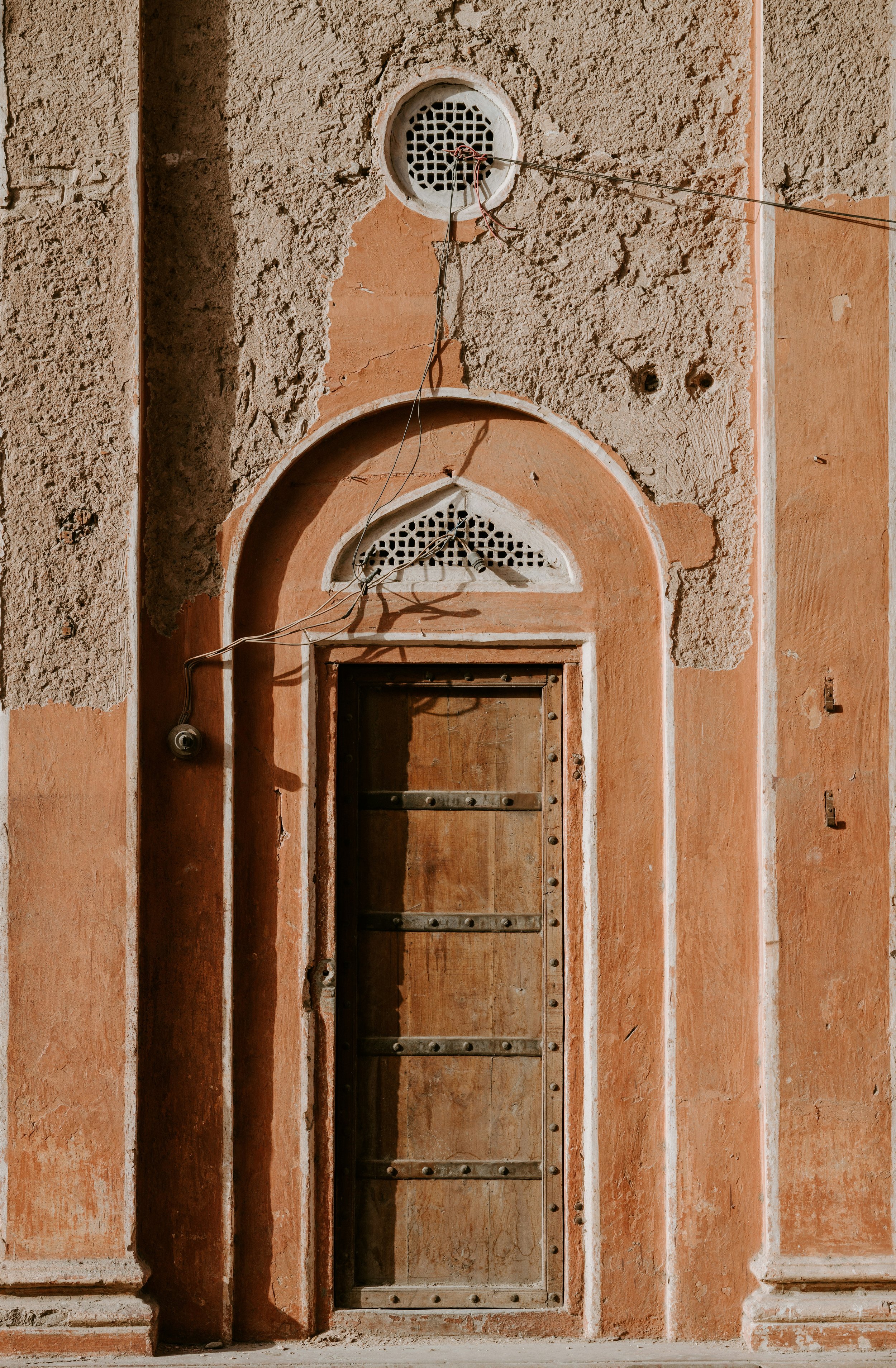
Use it as an accent colour alongside Perfect Plaster, pair it with Poolside Pink, or follow Matthew's lead and use it on your front door in Eggshell to pack a punch on arrival.
Moorish Lemon
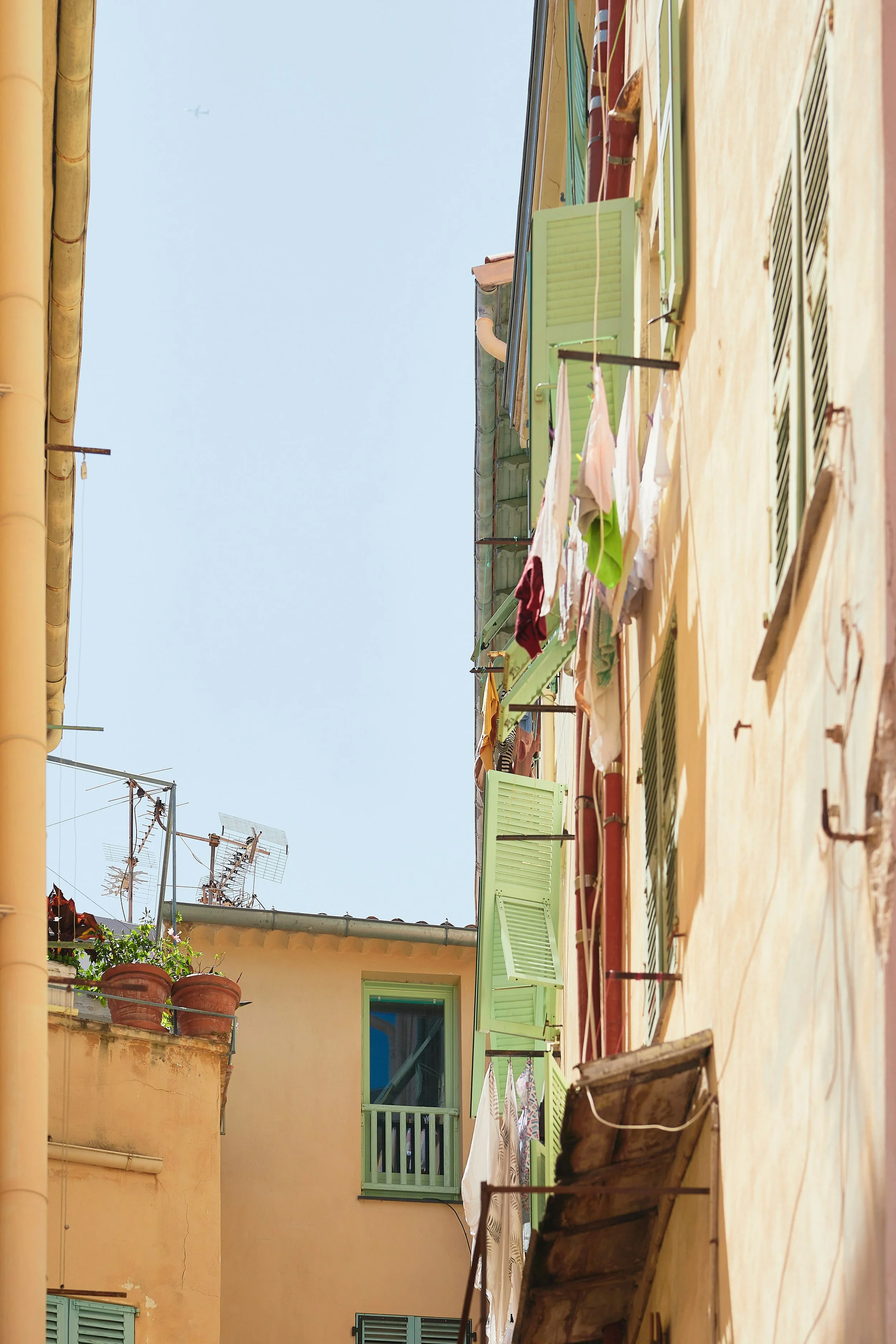
Paint: Moorish Lemon by Matthew Williamson & The Pickleson Paint Co. Location: Cassera71 | Photography: Andrea Pomelli
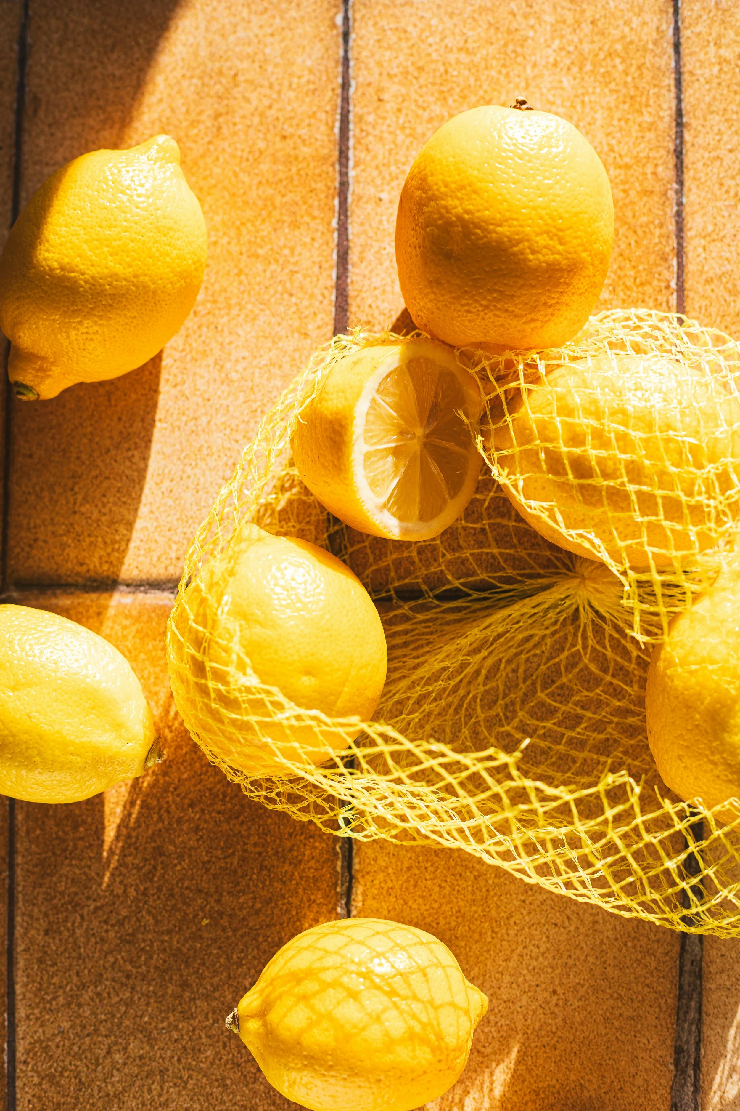

Moorish by name, moreish by nature.
A soft, sun-washed yellow with an almost translucent quality, this shade draws on the Moorish influence woven through Mallorca and across Spain’s cultural landscape, from tiled courtyards to citrus groves, and the cooling sweetness of lemon granita on a hot afternoon.
Full of sunshine. Gently knocked back. It brings a quiet, uplifting warmth that feels especially at home in a kitchen. Though use it once and you’ll find yourself wanting it everywhere.
A beautiful colour to wake up to, it pairs effortlessly with the richness of Señor Plum, the depth of Old Brass, and can be paired with Pedro Pink for something altogether more daring.
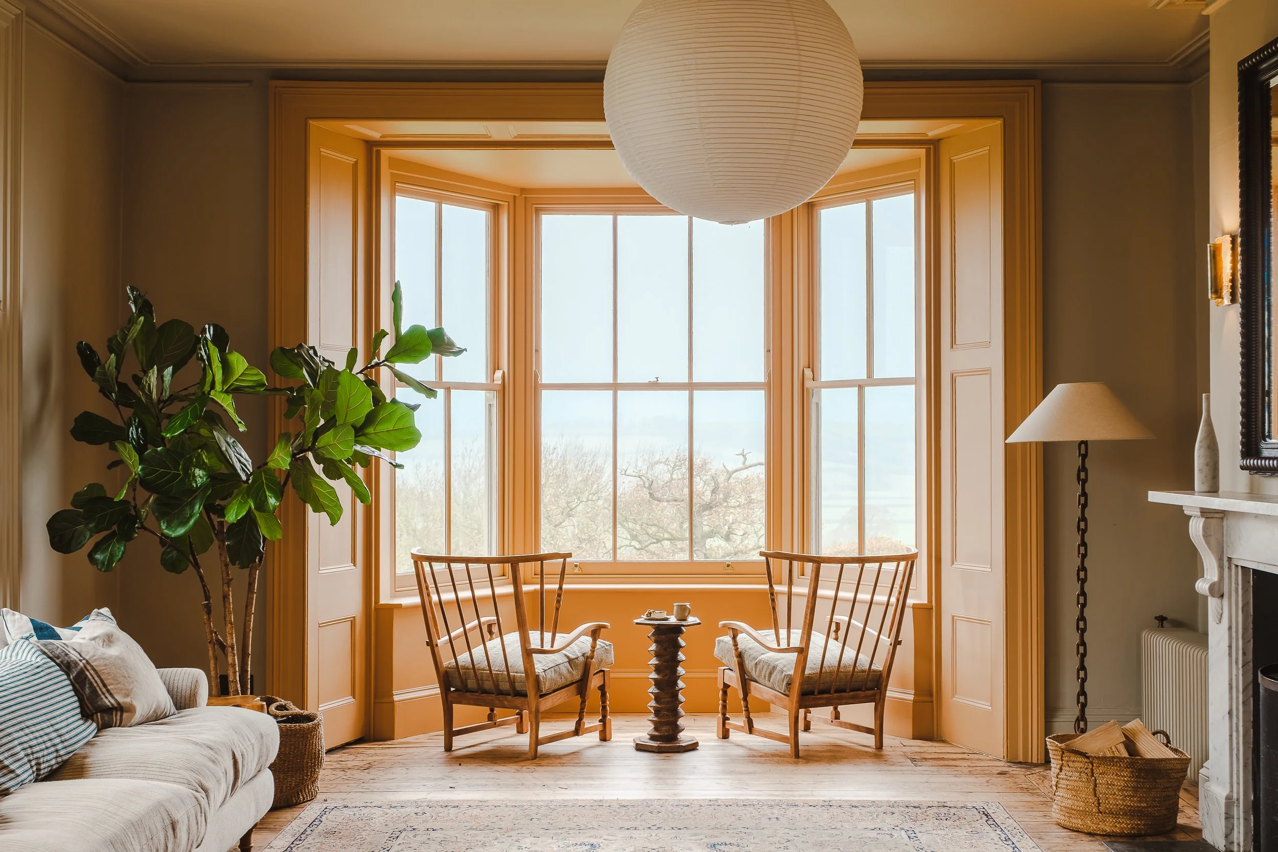
Old Brass

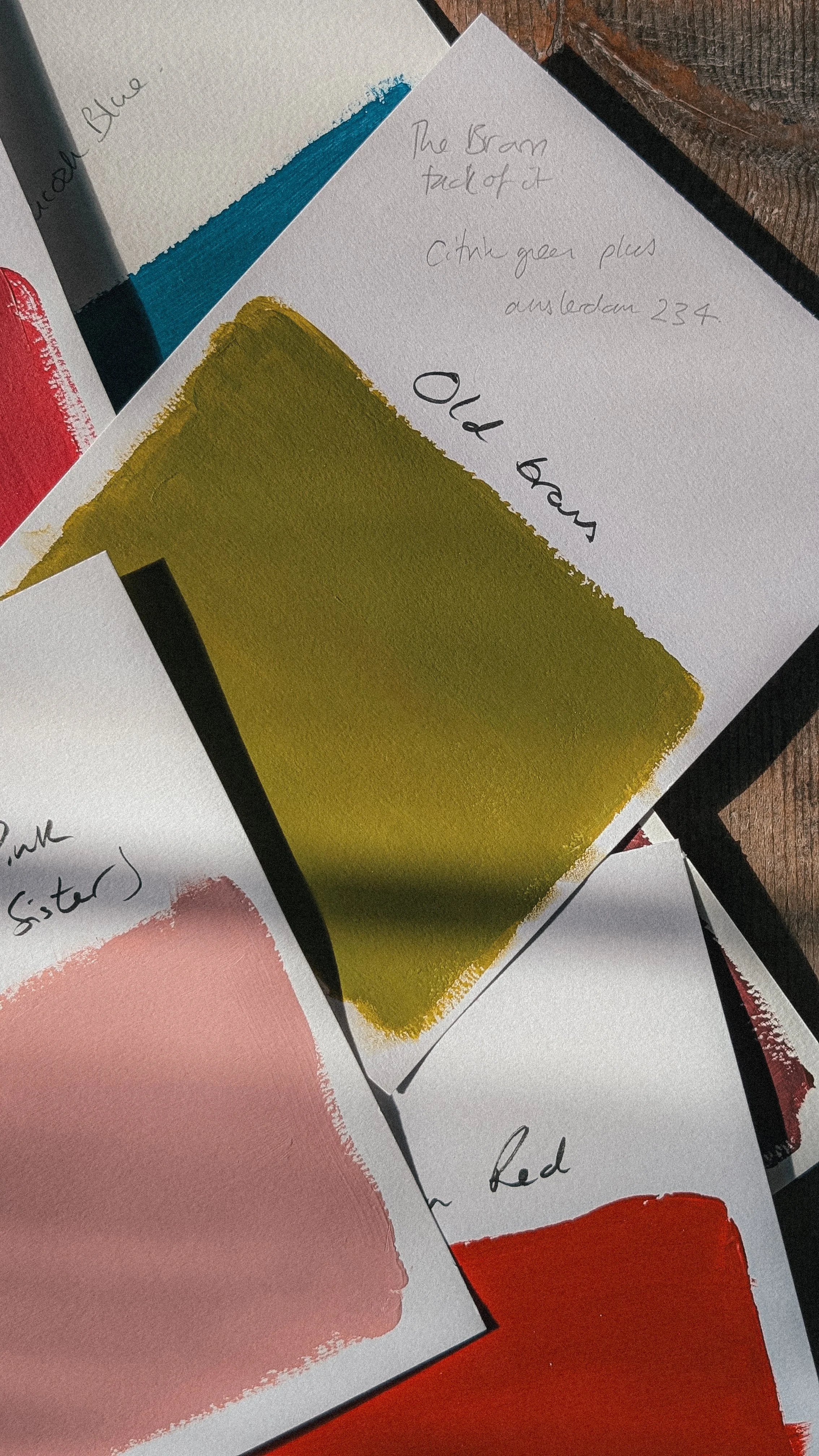

A short walk from Matthew’s home in Belsize Park sits a traditional fruiterer, washed in a rich, verdant green that has long caught his eye. Old Brass carries that same sense of abundance.
Nourishing and enriching, there’s something of the grand British townhouse here. Polished banisters, well-thumbed books, the soft gleam of antique hardware. Yet shift the light, or your perspective, and it becomes something else entirely. A Mediterranean olive, sun-warmed and easy, as if it has spent years basking on a Mallorcan terrace.
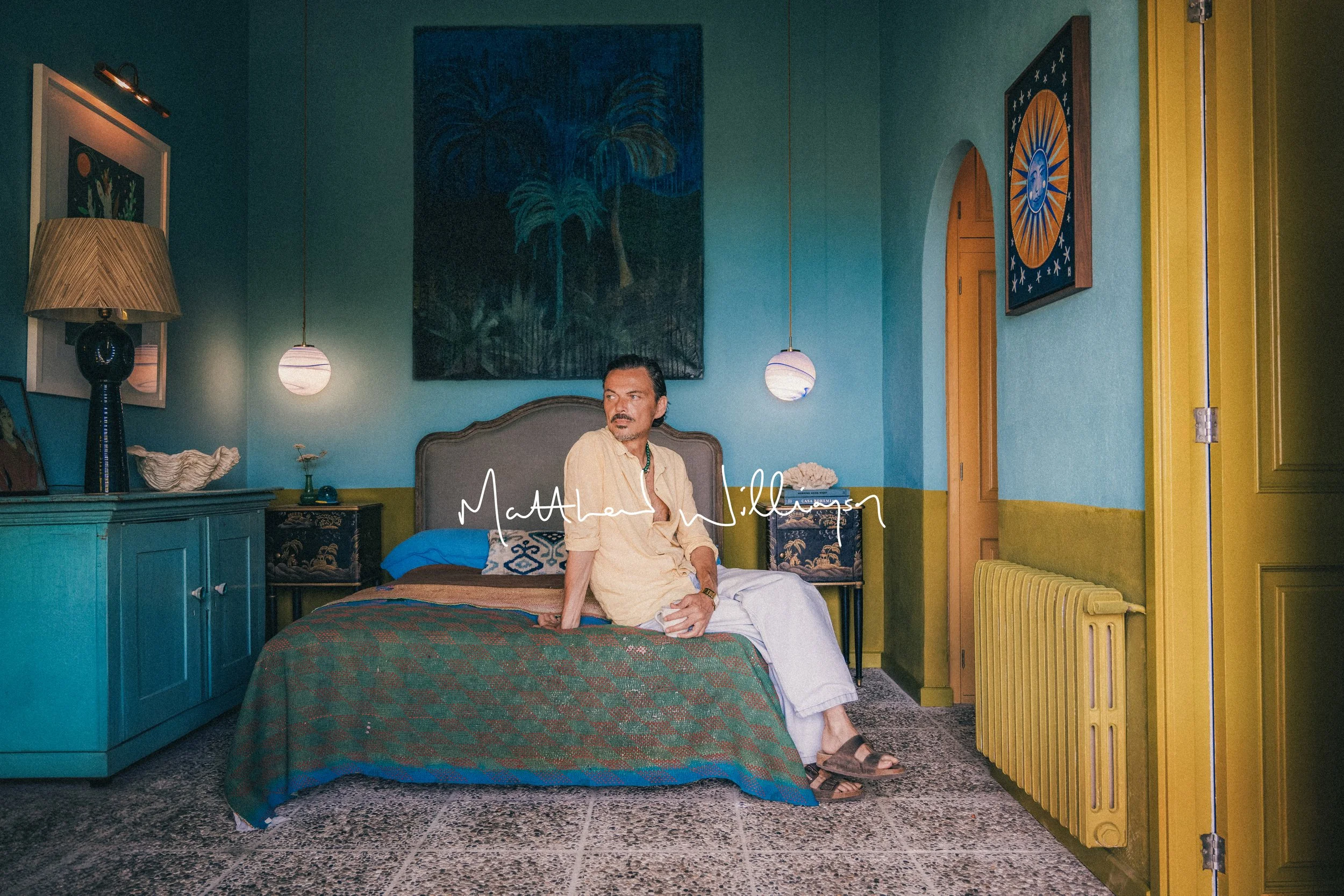
Pair it with Moorish Lemon for a combination that feels sunlit and generous, like citrus against olive groves. Or take inspiration from Matthew’s Balearic bedroom, where Old Brass meets Cala Blue and cuts an unexpected but compelling balance. Cool and warm, fresh and grounded, it creates a space that feels both calm and full of character. A little unusual at first, then entirely irresistible.
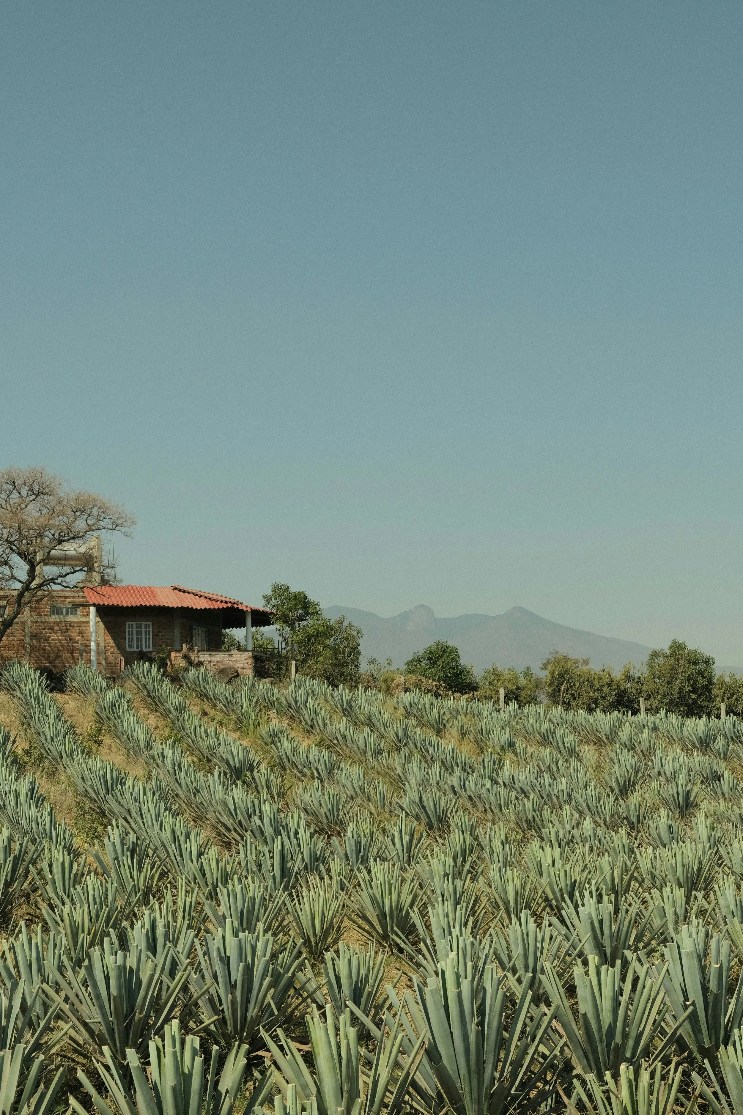
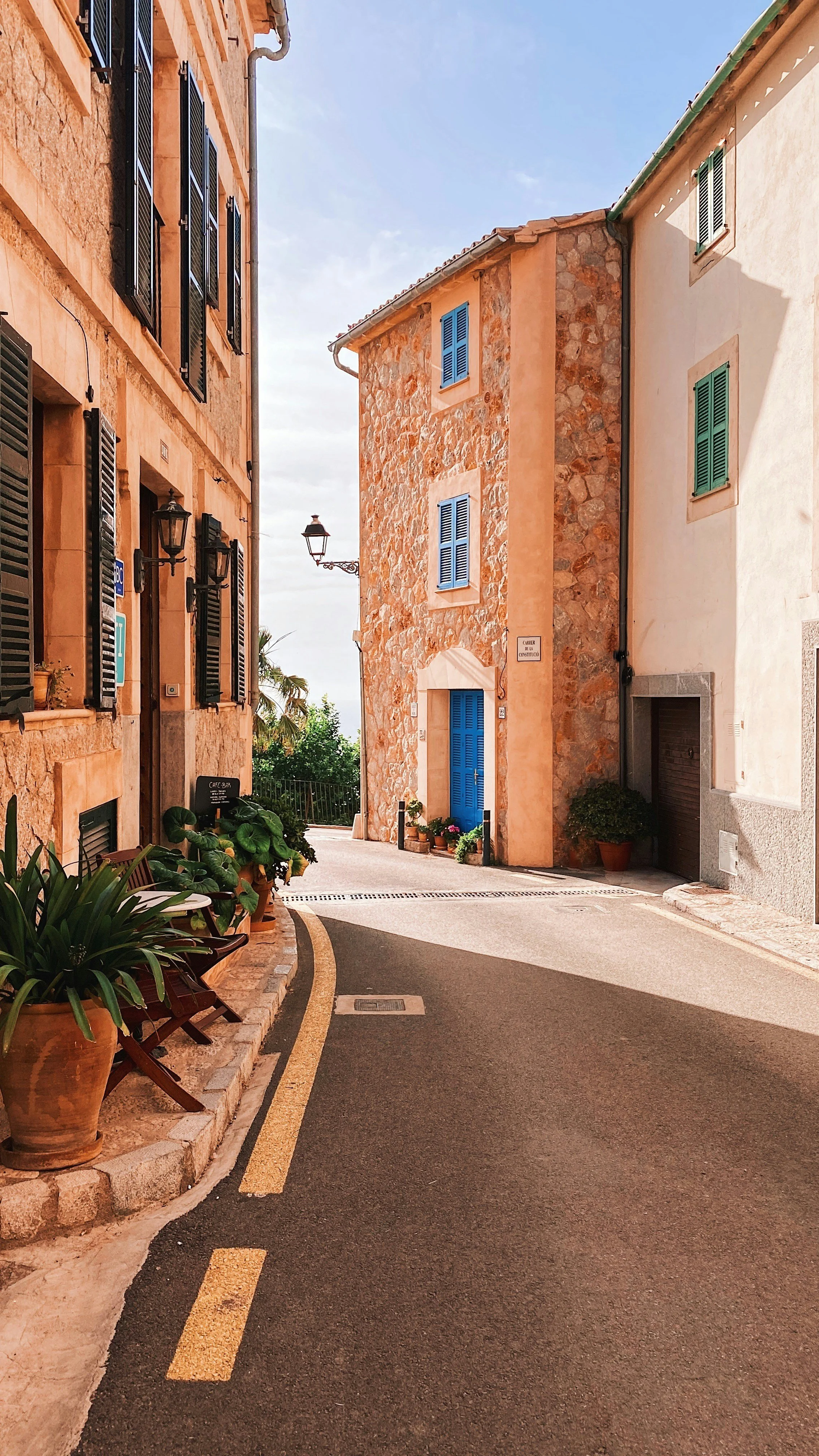
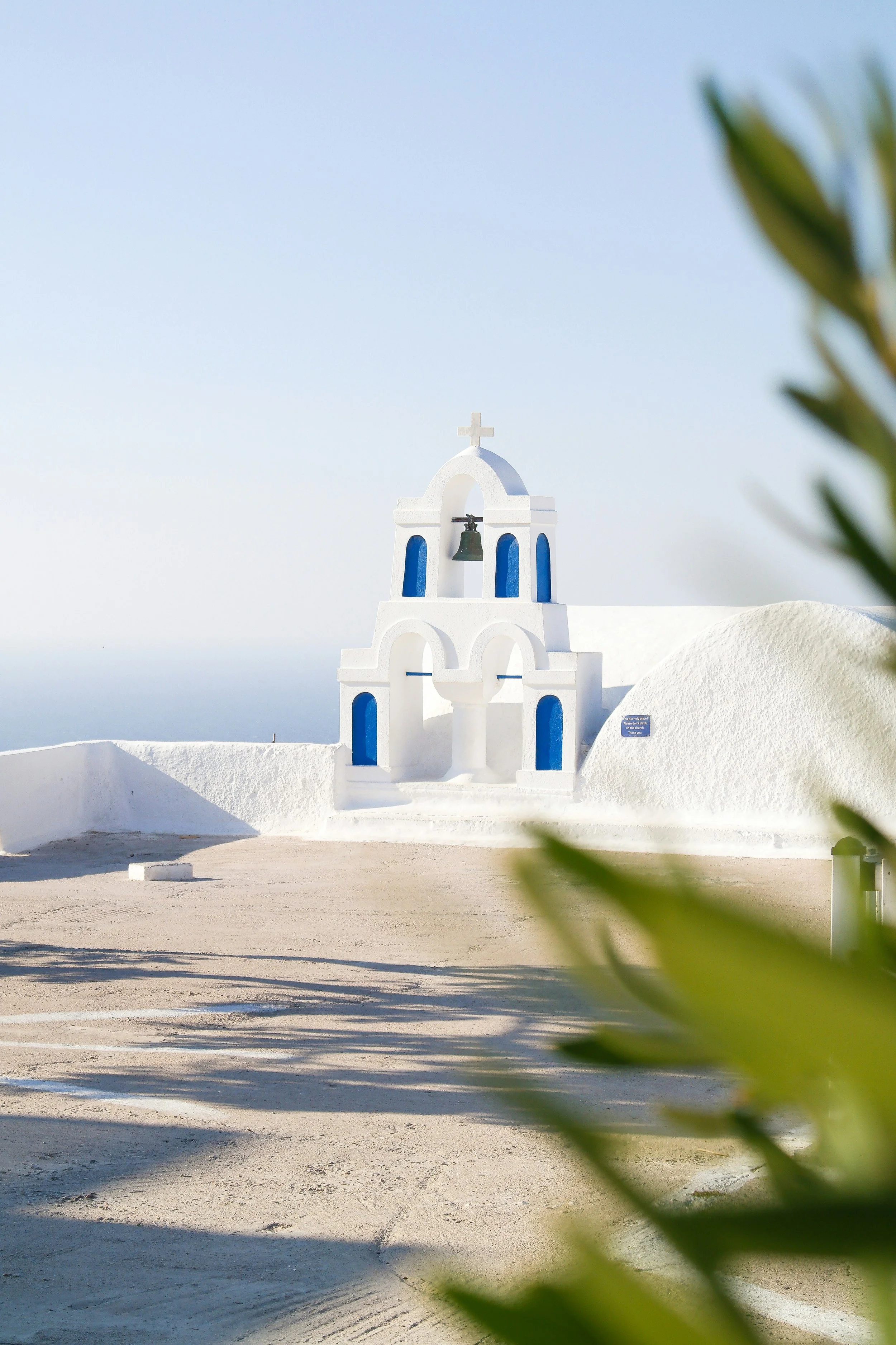
Cala Blue


Cala Blue is one of those rare shades that can make a small room feel expansive and a busy one feel instantly calmer. It quietly changes the pace of a home, bringing a sense of stillness without ever feeling cold.
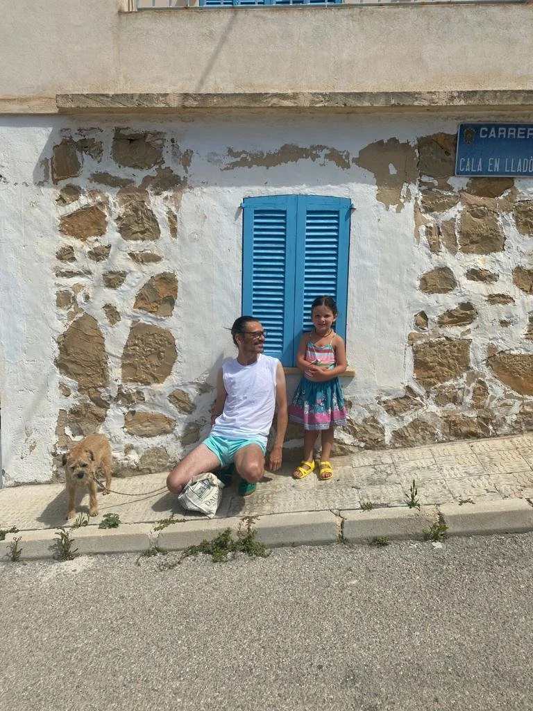
For Matthew, it’s reminiscent of weekends on the beach in Deià. Quality time spent with his partner Joseph and their daughter Skye in sheltered coves carved between cliffs. The shade sits somewhere between sea and sky, with a soft, weathered quality that gives it depth. The feeling of salt in the air, stone warmed by the sun, and water shifting gently in the light.
Pair it with Old Brass for a combination that feels both relaxed and unexpected. It also sits beautifully alongside Estate Green for something timeless and garden-like, or with Portland Blue if you want to push the blue tones further and create a richer, more spirited scheme.
Estate Green

Estate Green is a quietly confident shade that can feel stately one moment and unexpectedly fresh the next, always shifting beautifully with the light around it. Restful, peaceful and wonderfully versatile, it is an ideal choice for full room coverage, bringing a sense of calm while making a space feel more open, inviting and far grander than its proportions suggest.
Style it with Perfect Plaster for gentle warmth, or pair it with Cala Blue or Joseph’s Gelato for a chic, balanced scheme. For something richer and more dramatic, contrast it with Señor Plum, Ocelli Blue or Aphrodite Orange.
Portland Blue

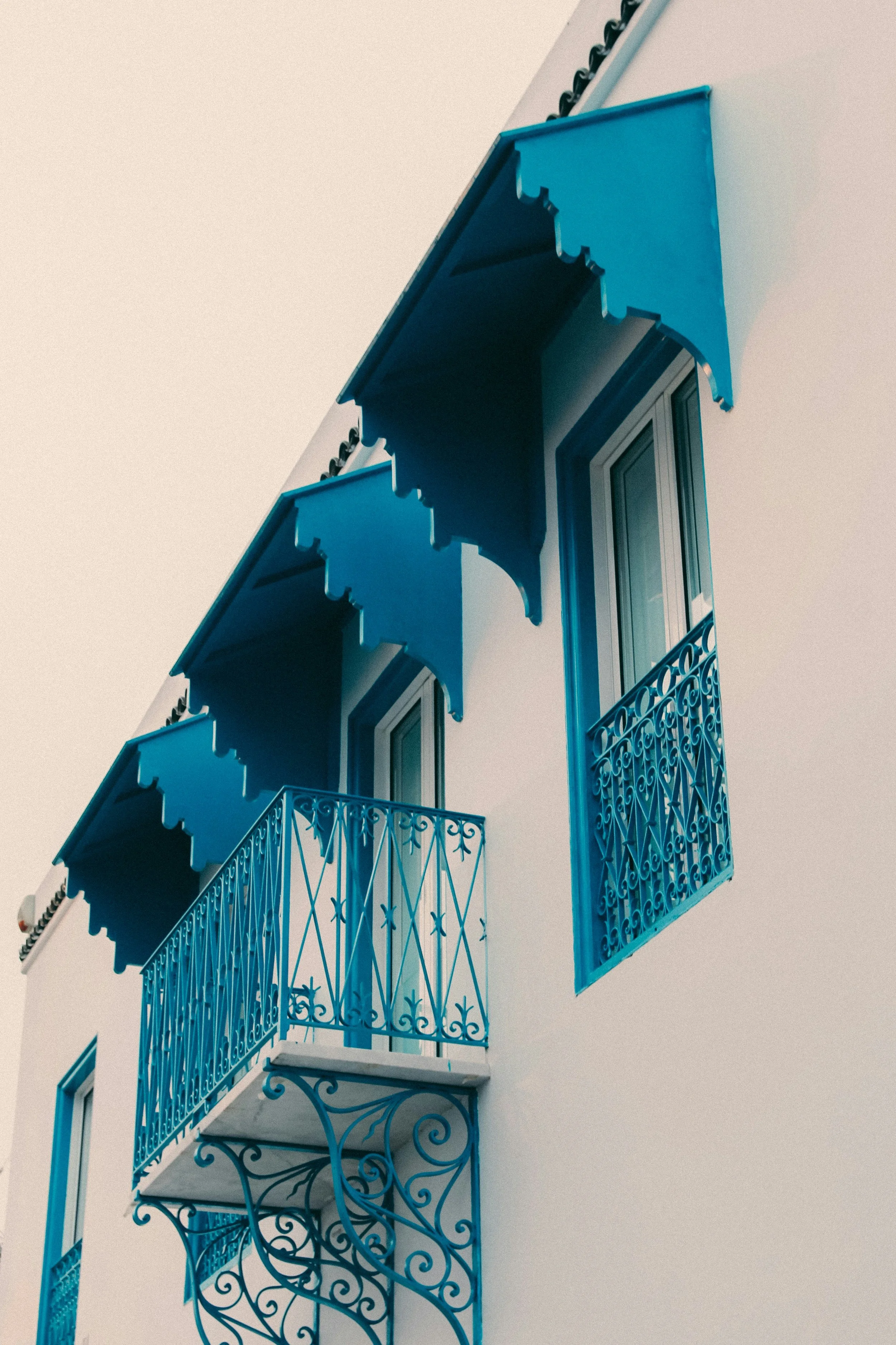
Portland Blue is the kind of colour that instantly sharpens a scheme. Named after the city where Matthew’s daughter, Skye, was born, it carries a personal significance, yet its appeal feels entirely universal.
For Matthew, this is the accent colour equivalent of “the shoes to your outfit”. Think sideboards, bedside tables, joinery or a single, intentional kick of colour that shifts the whole mood of a room.
Inspired by the electric blue of Yves Klein and the vivid cobalt of La Casa Azul, Portland Blue takes that depth and intensity and softens it slightly. It retains a striking, artistic energy, but with an ease that allows it to sit beautifully in all kinds of interiors.
Pair it with Estate Green for something grounded and elegant, or with Cala Blue to create a tonal scheme that feels layered and fresh.
Palma Clay

Paint: Palma Clay by Matthew Williamson & The Pickleson Paint Co. Location: South Cross House, Devon | Photography: Dom Palmer
Palma Clay brings together two sides of Matthew’s world, pairing sun-soaked Spanish living with unmistakable British design sensibility.
Rooted in the warmth of baked terracotta, this shade carries a quiet confidence. It has a way of bathing a space in soft, honeyed light, while still feeling entirely at home in a classic British interior.
It works beautifully across larger surfaces, adding depth without heaviness, and a grounded, earthy ease wherever it’s used.
Use alongside Aphrodite Orange for a rich, liveable palette, or drench your space for something cosy, cocooning and indulgent.
Pedro Pink
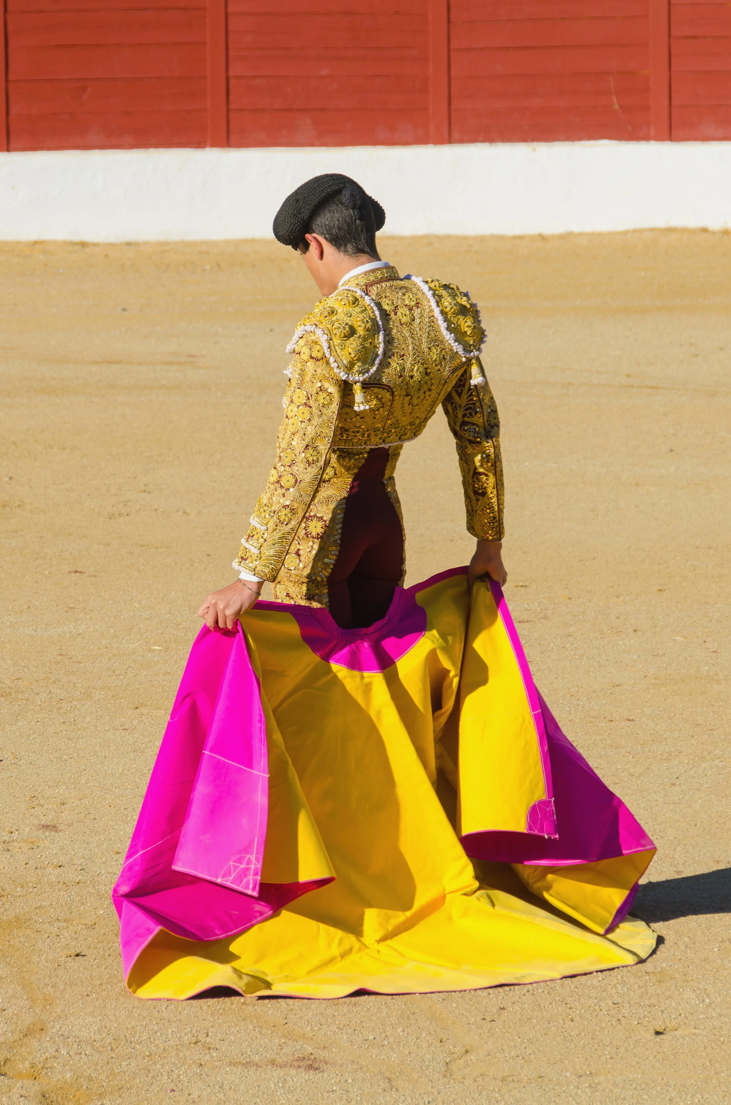

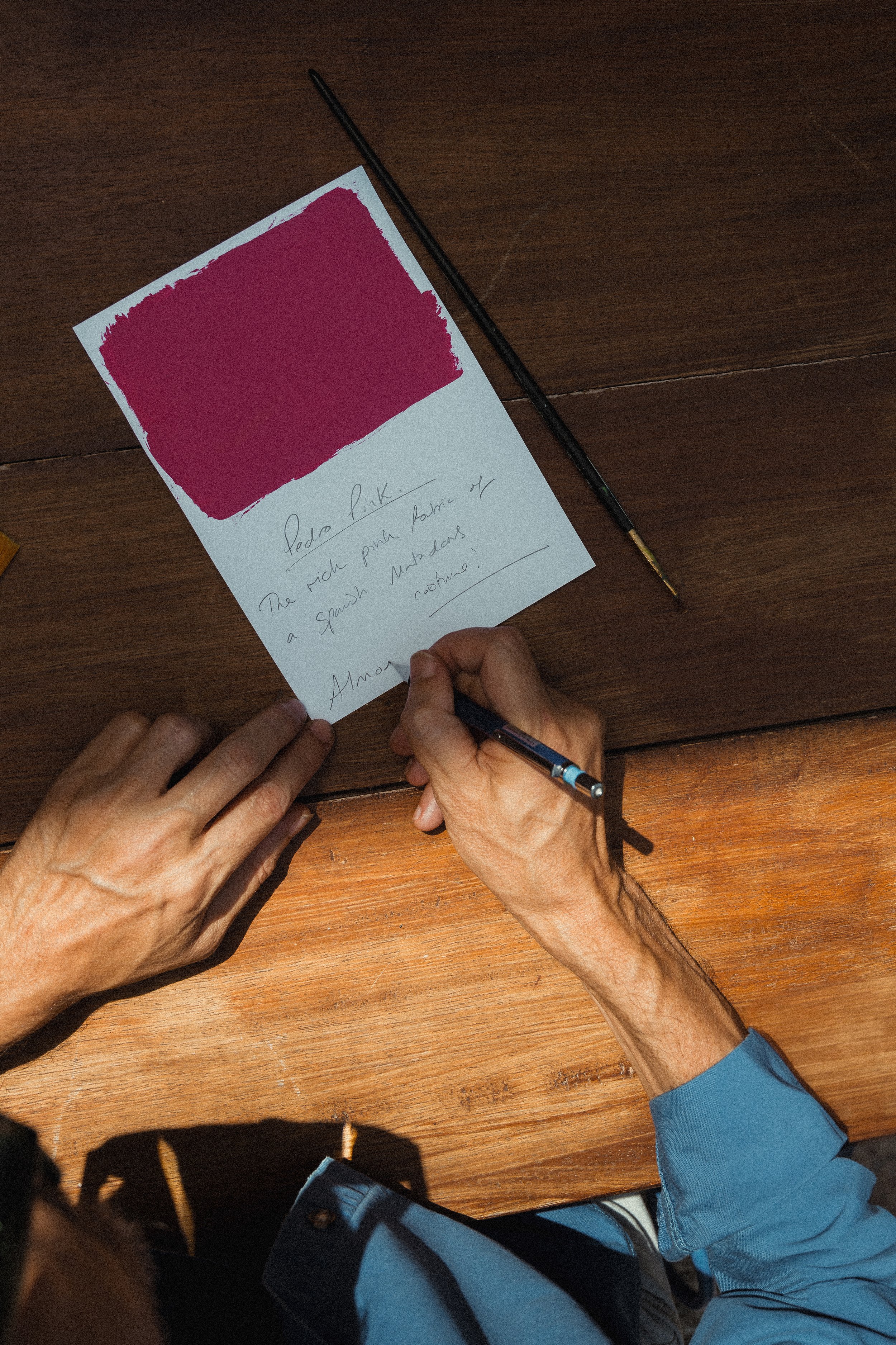
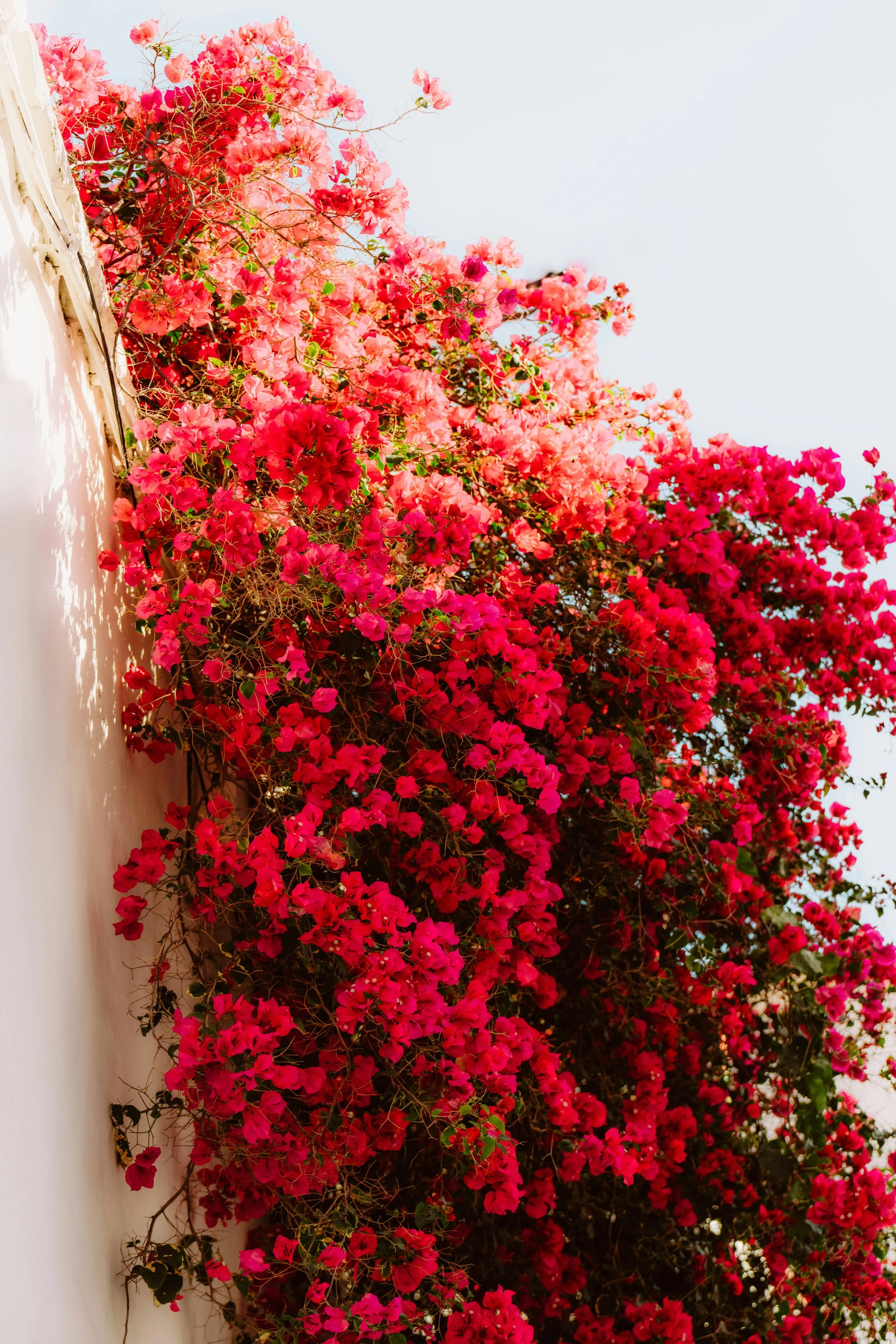

Once piercing, now patina’d by time, Pedro Pink feels like a hot pink that has lived a little. It still has fire in its belly, but its edges have mellowed, giving it a worn glamour that feels both sexy and sophisticated. Think the washed embroidery of a torero’s jacket, or bougainvillea petals bleached pale at the tips by the Spanish midday sun.
With pink a staple of Matthew’s visual world, Pedro jolts the system and tweaks the tempo of any room it enters. It need not be expansive. Even a small dose will have you wondering why he hasn’t called since you shared a kiss in El Centro Historico.
Pair Pedro with Moorish Lemon for the full banderillero experience, turn up the heat by placing alongside Poolside Pink, or use it as an accent for Estate Green to make him suitable enough to meet your mother.
CorazÓn Red
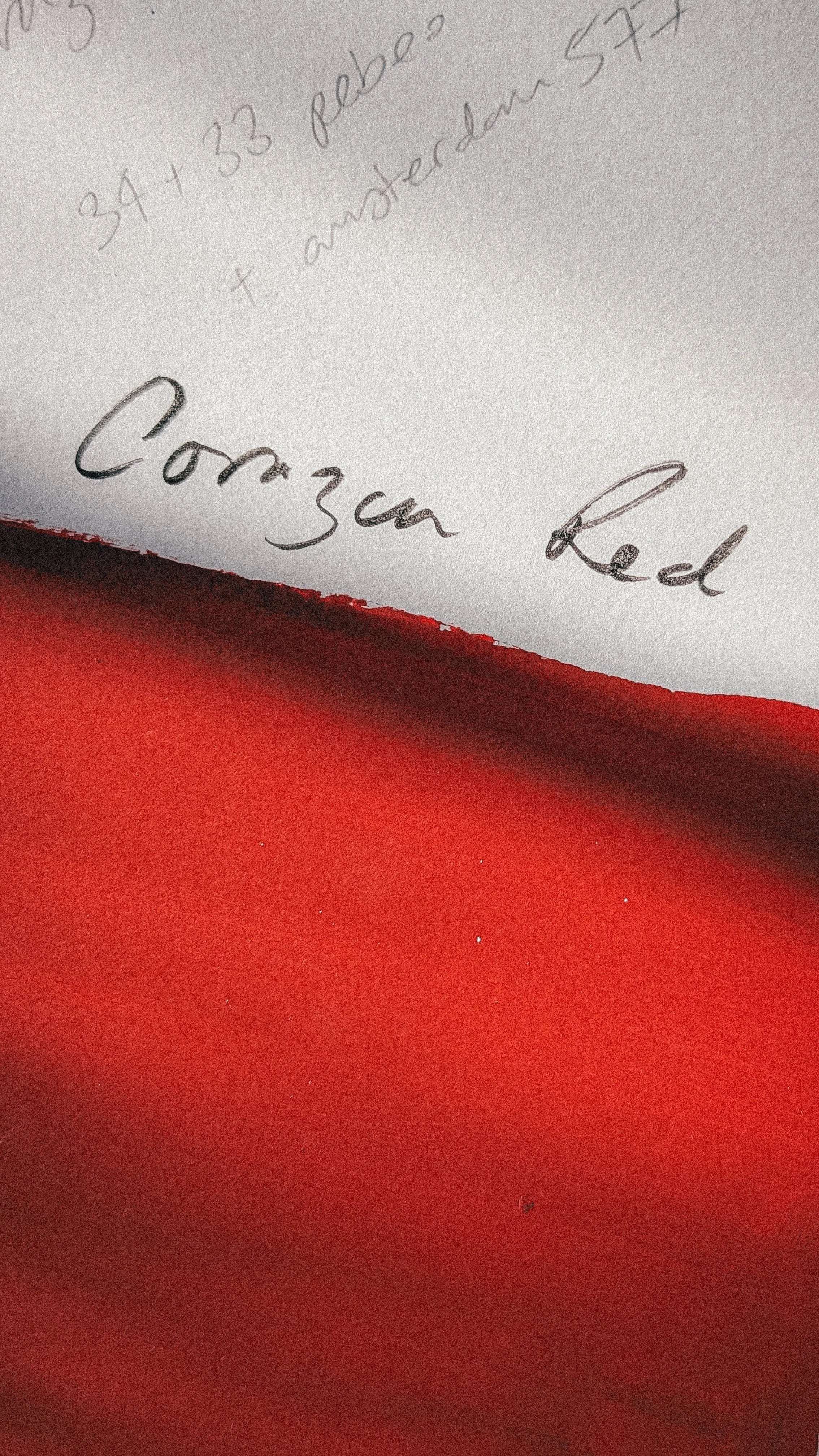


This is a shade that sets a mood and keeps it. To be used with relative caution and relative confidence, it is dramatic when you want it to be, but grounding when you need it most. Whether it is a hit of unexpected red or a full room in a defiant act of passion, consider this colour your rojo de por vida.
Set a modern Mediterranean mood by painting alongside Paloma Peach, or cool things down with Perfect Plaster.
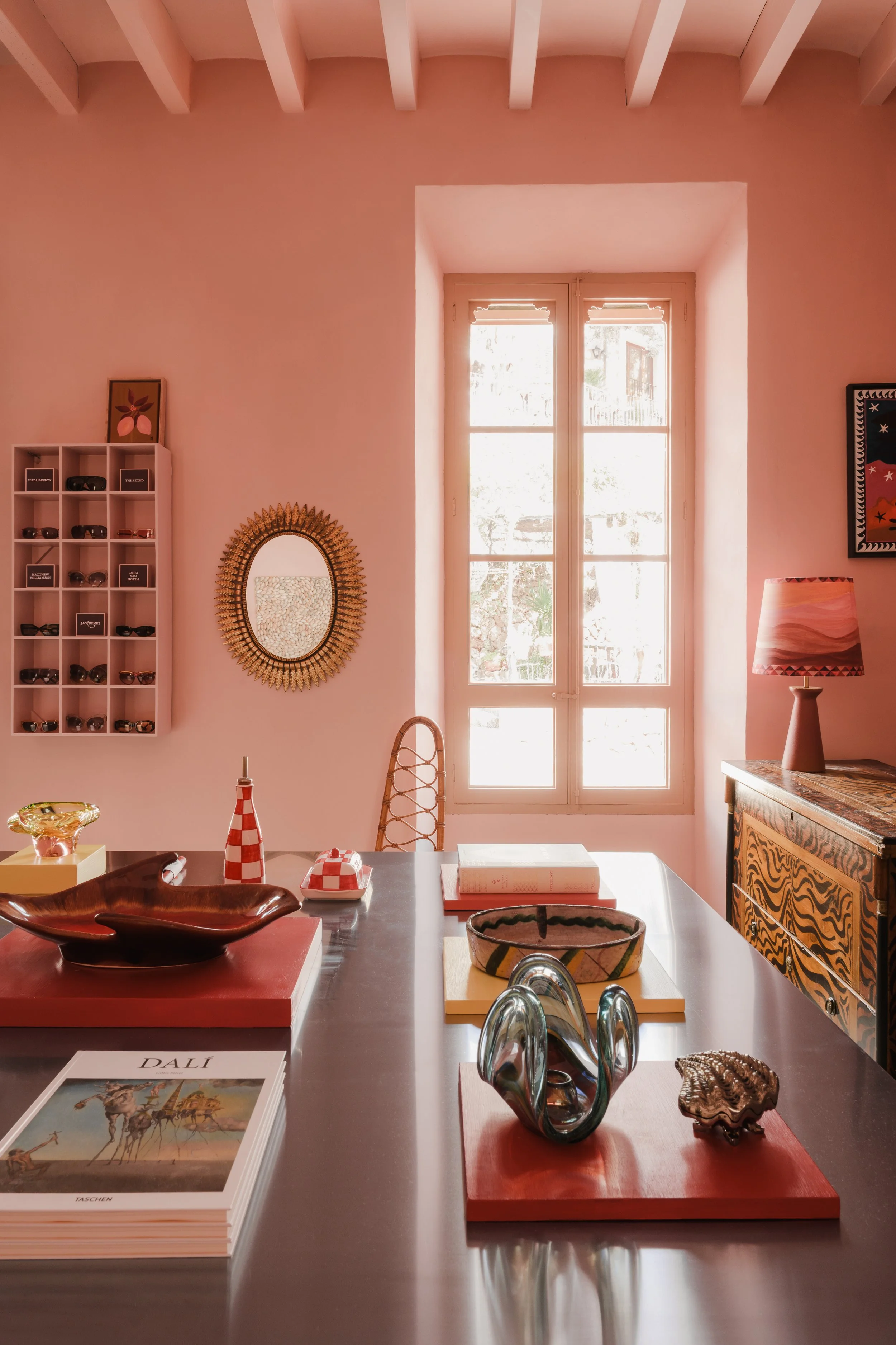
Perfect Plaster


To know Matthew Williamson is to know that ‘neutral’ is not a word he is particularly comfortable with. But in a world full of colour, this was a necessary inclusion.
A drenchable, infinitely usable shade that allows the more saturated colours to take the limelight as and when required. There is a softness to it, with hints of pink, linen and beige working quietly in the background.
Stay in sun-blushed territory by pairing with Paloma Peach, or sink into golden hour with Aphrodite Orange, Señor Plum or Pedro Pink.
Joseph’s Gelato

Creamy, sun-softened, and good enough to scoop, this shade is as indulgent as it is uplifting.
Named after Matthew’s partner, who has a particular love for this colour, it carries a gentle sweetness without ever tipping into the saccharine. On the drive from Palma to Deià, there is a house painted in almost precisely this shade, and neither Matthew nor Joseph can pass it without admiring it.
In bright light it feels fresh and almost icy, while in shade it takes on a subtle pistachio softness. It brings a lightness that feels both comforting and refined. Pair it with Cala Blue to bring it back down to sea level, or combine it with Aphrodite Orange to add depth without losing its easy charm.
Paloma Peach


A true throwback colour, Paloma Peach would not have looked out of place in the 1970s, the decade Matthew loves most of all for design. There is something unmistakably nostalgic about it, echoing sun-soaked beach holidays, retro fruit salads and hazy summer sunsets.
What started life as a much punchier shade was pushed back and forth until it landed in exactly the right place. The result is a peach that feels perfectly judged. Juicy and luminous in the morning light, it deepens by golden hour and slips into something richer and more seductive.
Pairing Paloma Peach with Perfect Plaster makes the 70s feel ripe for revival. Estate Green flings it into the 80s with a Miami-inspired mood, while Corazón Red or Señor Plum offer something more modern and full of confidence.
Larder Green
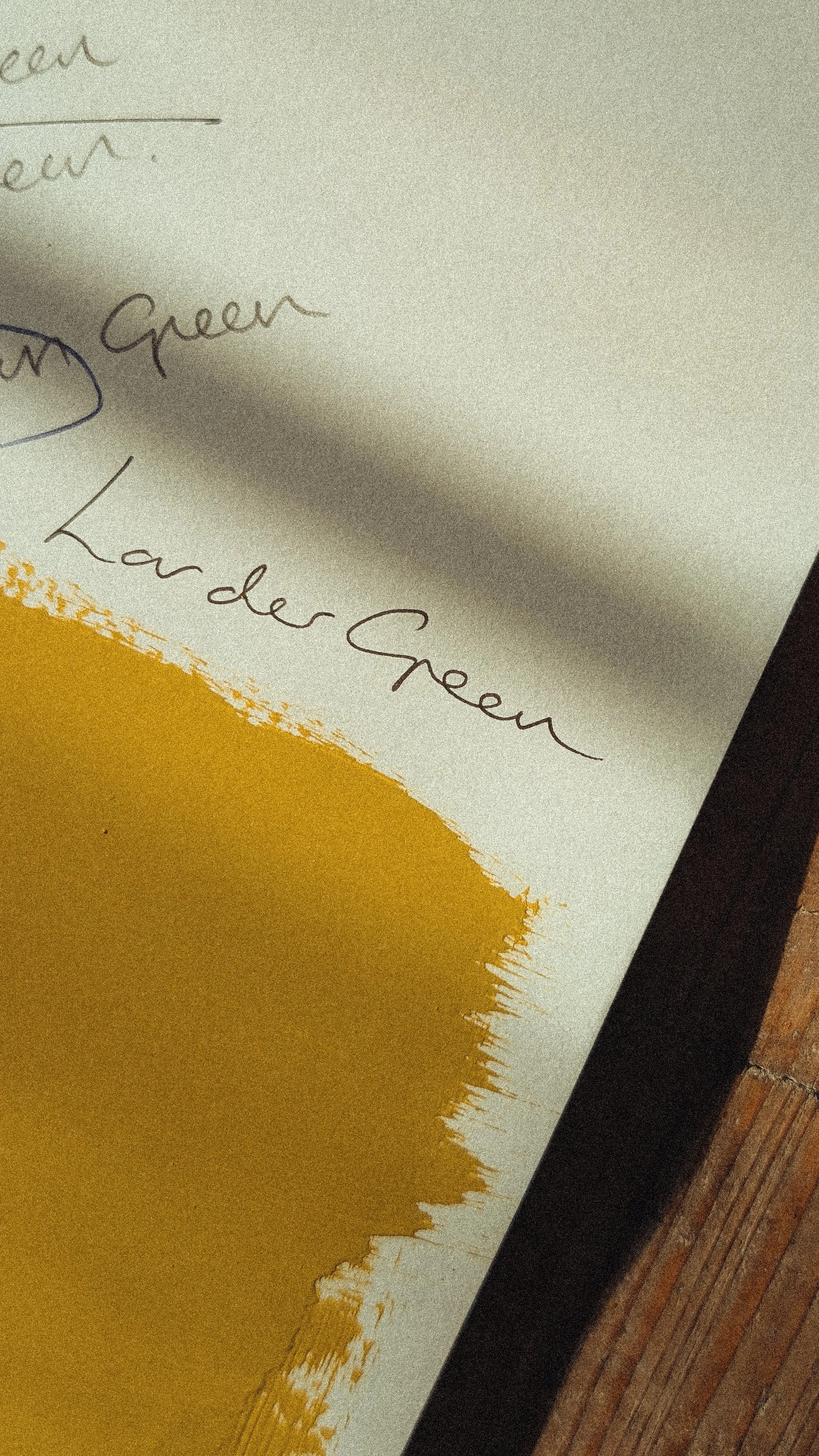
This is not a colour that tries to please everyone. In fact, it famously does not. But for Matthew, it is a modern, fresh chartreuse, and unequivocally for him.
Unexpectedly versatile, Larder Green is bright and beautifully balanced in daylight and atmospheric by evening. It sits just as comfortably wrapped around cabinetry as it does across four walls, bringing a confident, spirited energy wherever it lands.
Pair it with Señor Plum for a rich, grounded palette reminiscent of the British countryside, or temper its wasabi-like edge with Perfect Plaster for something quietly assured.
Señor Plum
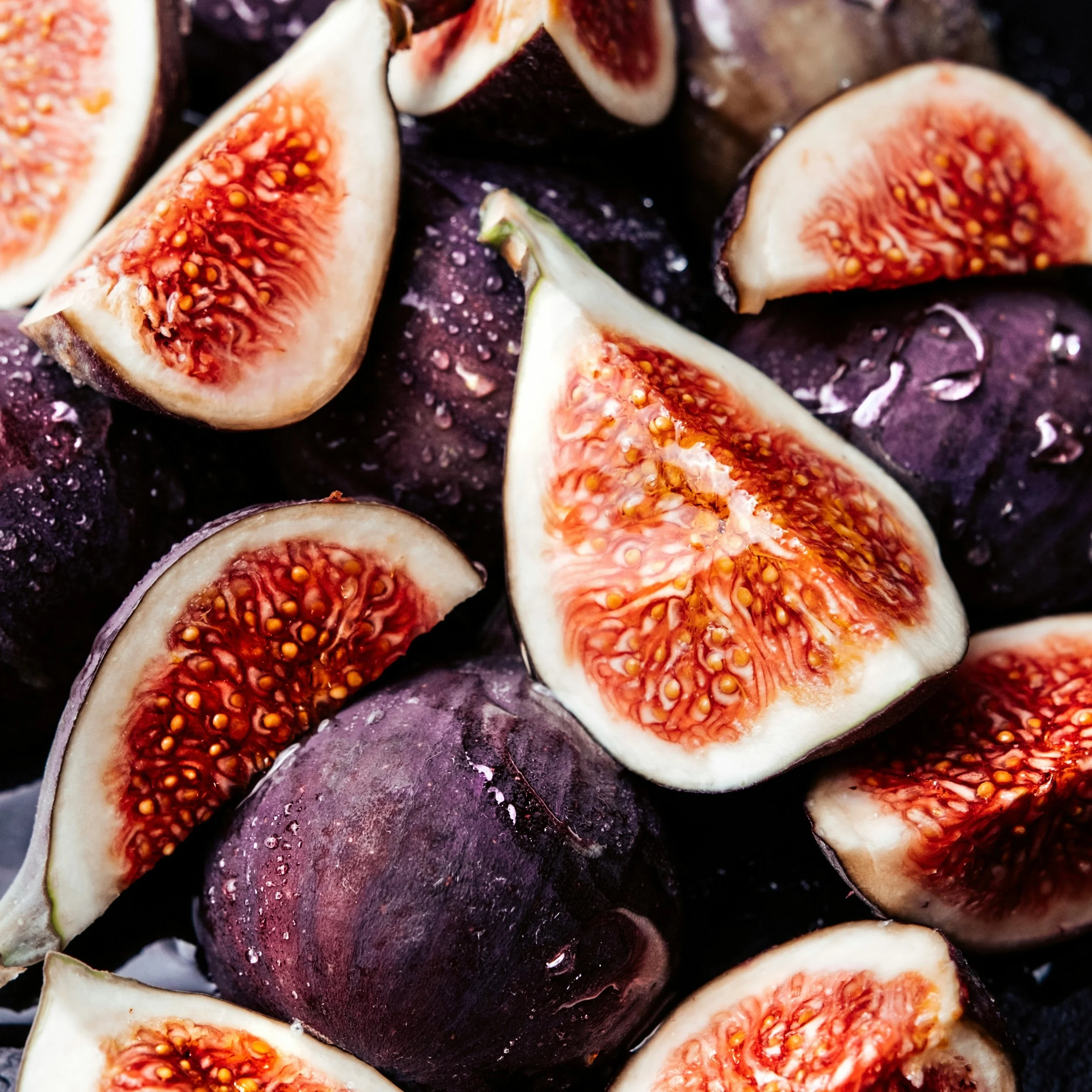
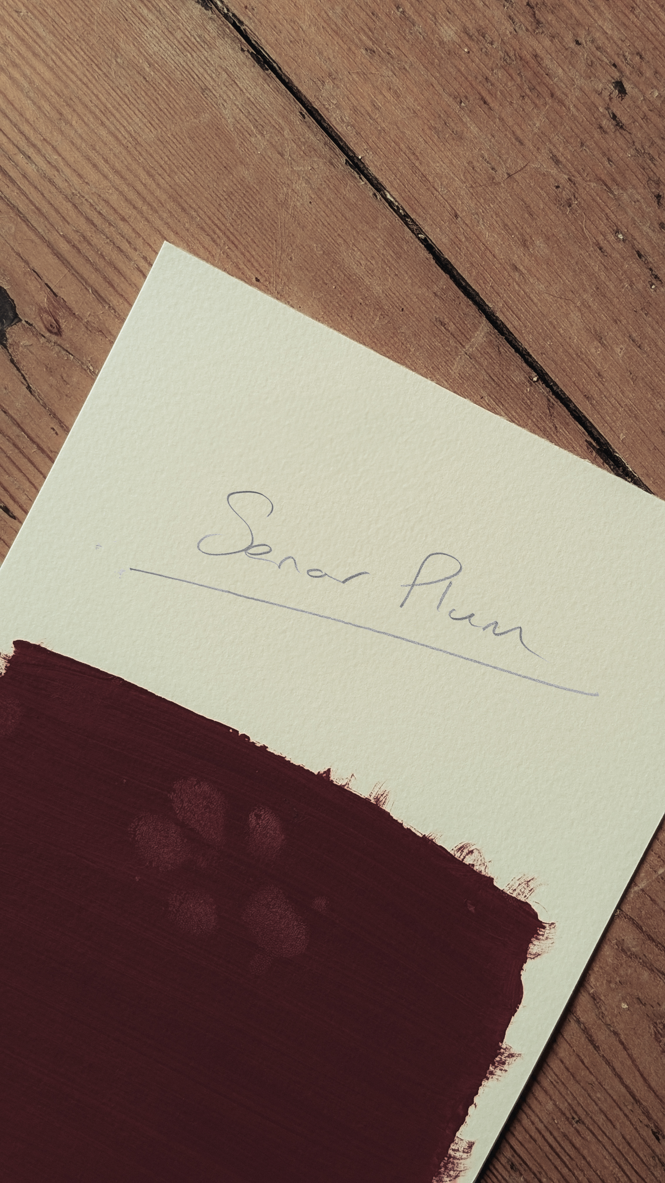
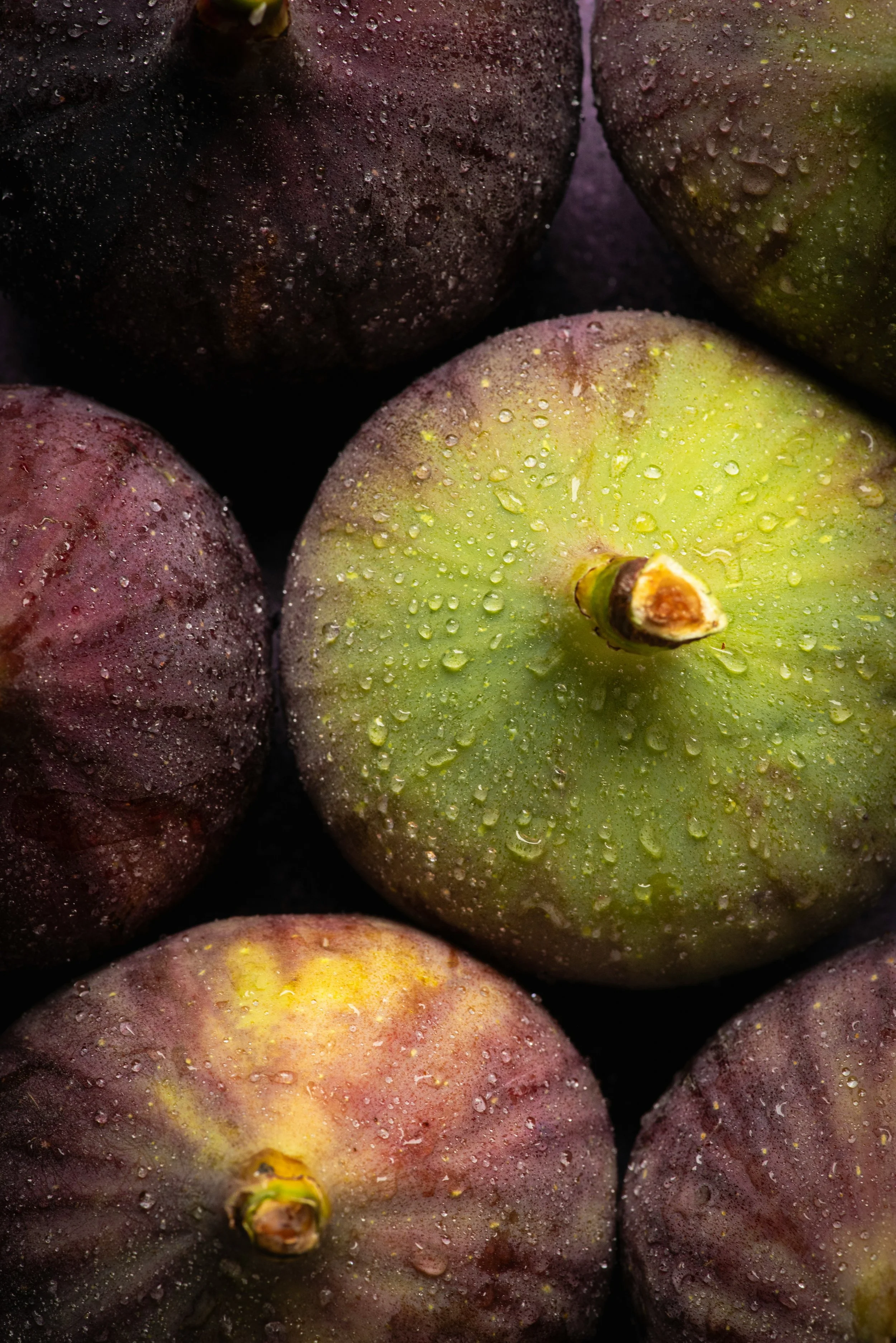
Despite being named after Matthew’s dog, Señor Plum is a deep, rich and unapologetically seductive colour that leans into its own intensity. Think baked plums and ripe figs, worn leather and shades of wine. This is a colour that knows how to hold a room.
Used across a full space, it creates a cocooning, den-like atmosphere that feels intimate, enveloping and decadent. It’s a confident choice, but one that rewards you the moment you commit. For contrast, pair it with Larder Green. It’s a combination rooted in nature and creates a palette that is both striking and effortlessly balanced.
Poolside Pink
Paint: Poolside Pool by Matthew Williamson & The Pickleson Paint Co. Location: Cassera71 | Photography: Andrea Pomelli
Pink is the colour Matthew is perhaps most closely associated with, so he felt duty bound to create the most perfectly liveable version for this collection. Poolside Pink is an evolution of our Lido Pink, the shade that still drenches Matthew’s London home and the reason our paths first crossed. This is Lido’s older sister.
There is something gently sun-faded about it. It feels lived in, if not antique. Soft without being sugary and easy on the eye without being showy.
This sun-kissed pink shifts from playful in the morning to golden and glowing by dusk. It relaxes beautifully with natural textures but comes alive against bold prints and stripes. Think late afternoons under a cabana, tiled terraces and a Grasshopper in hand.
Pair with Paloma Peach for a deliciously retro palette, or lean into cocktail hour with Corazón Red or Señor Plum.
Ocelli Blue


Neither green nor blue in the expected sense, Ocelli Blue is richly saturated, theatrical and utterly unapologetic.
Named for the jewel-like markings found in peacock feathers, a recurring motif in Matthew’s work, this shade carries the same sense of opulence and ornament. It is a colour that does not sit quietly.
Drench a room for full-feathered decadence, combine with Joseph’s Gelato for a space that feels balanced, breezy, and effortlessly composed. Alternatively, tame it with Perfect Plaster for a nostalgic yet modern vibe.
So there you have it, sixteen new colours made in collaboration with the man himself.
For Matthew, this is a long-held ambition realised. For us, it marks a defining chapter. Something built slowly, instinctively, and with a huge amount of trust on both sides.
These colours has been four years in the making. Now, they’re ready to be lived with.