Shutters Should Be White, Apparently
Pickleson x Shutterly Fabulous. for those who refuse to live with boring windows
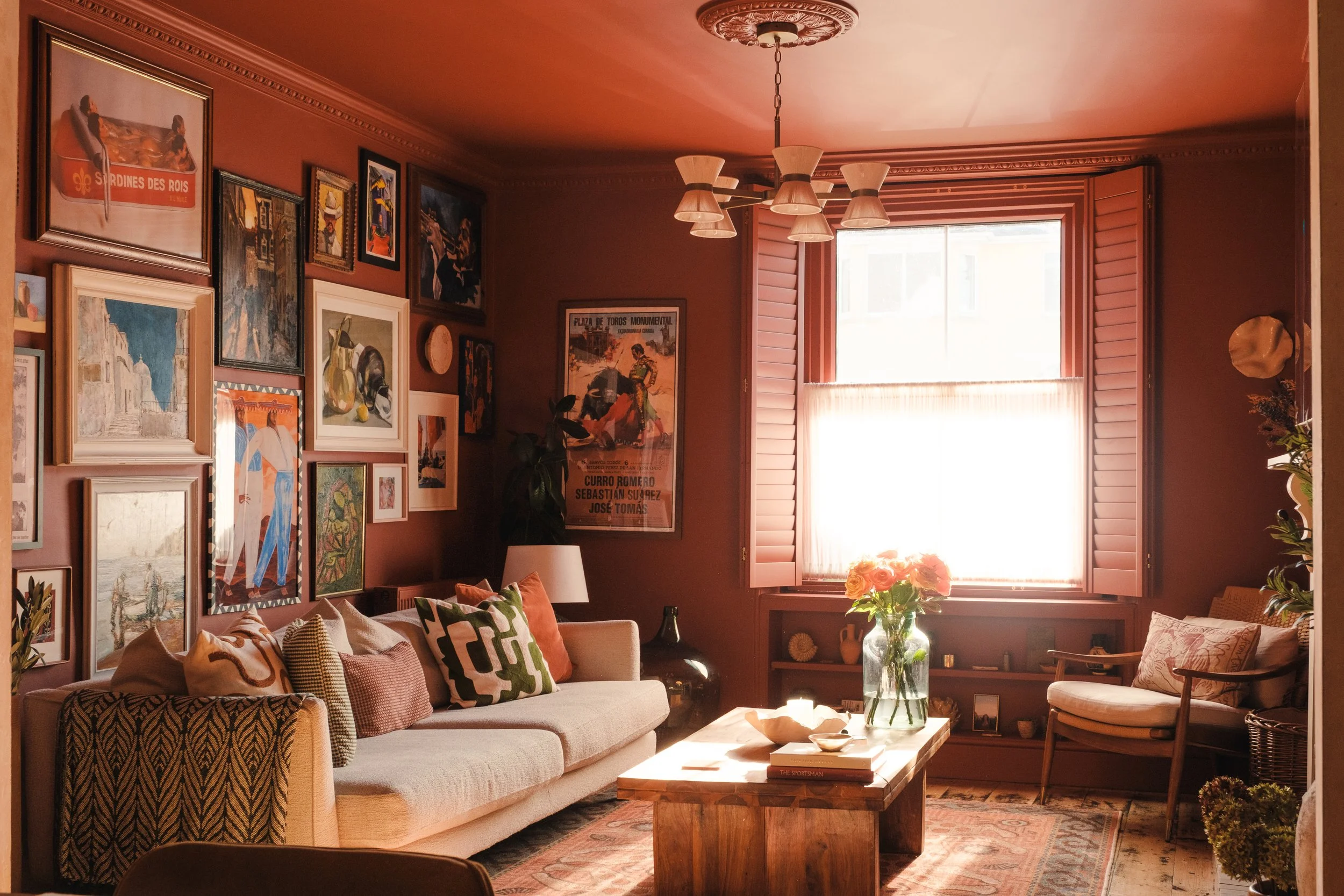
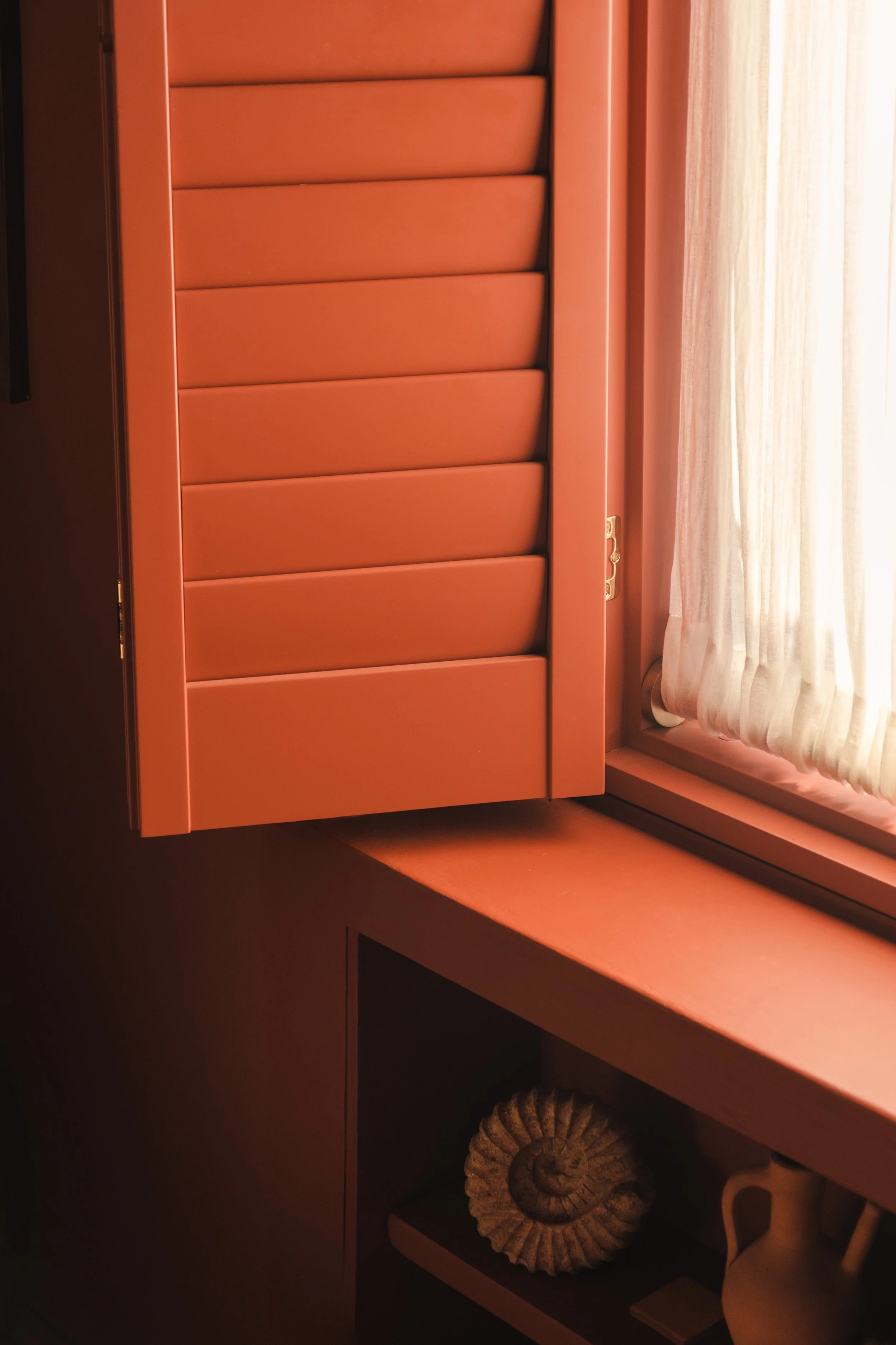
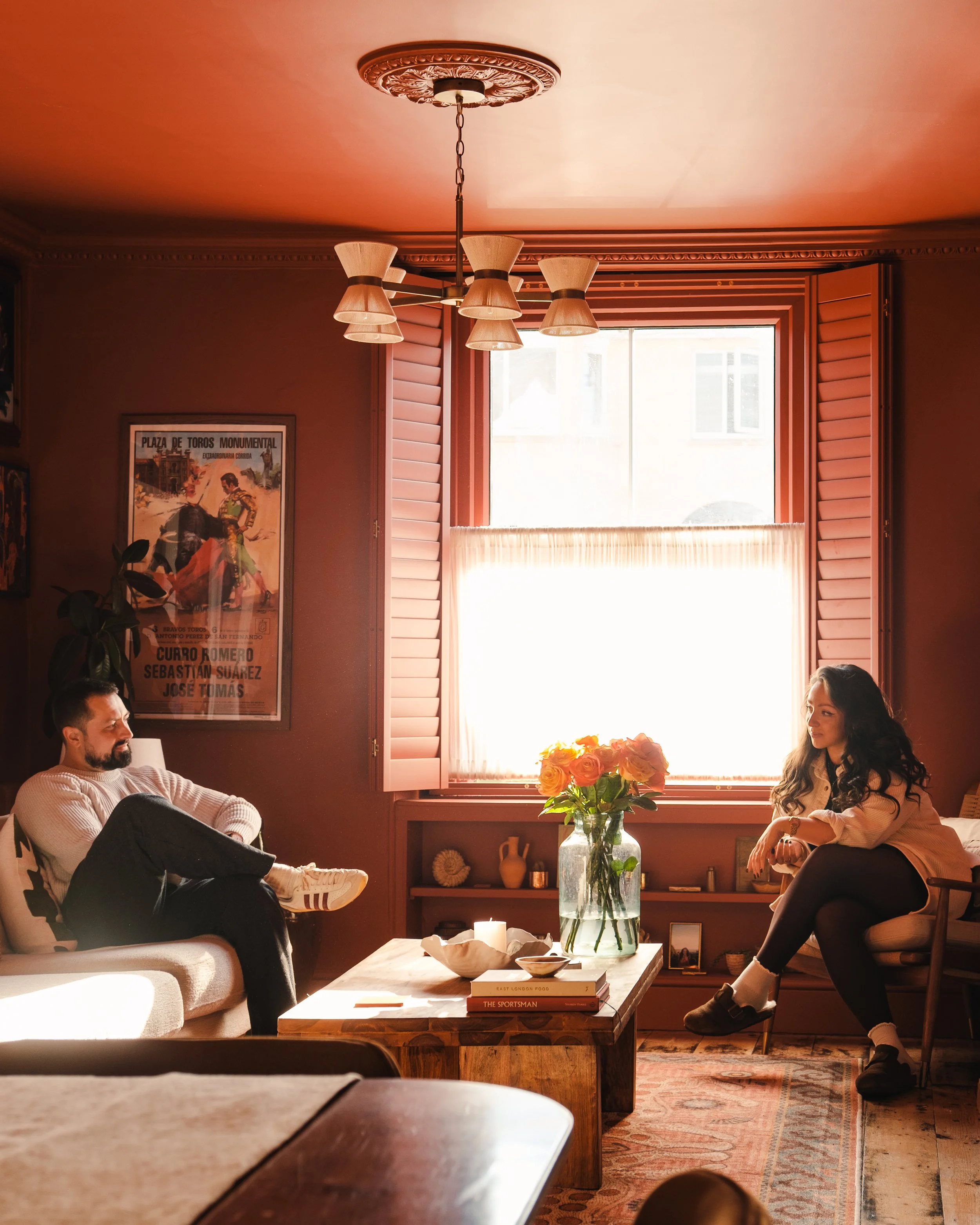
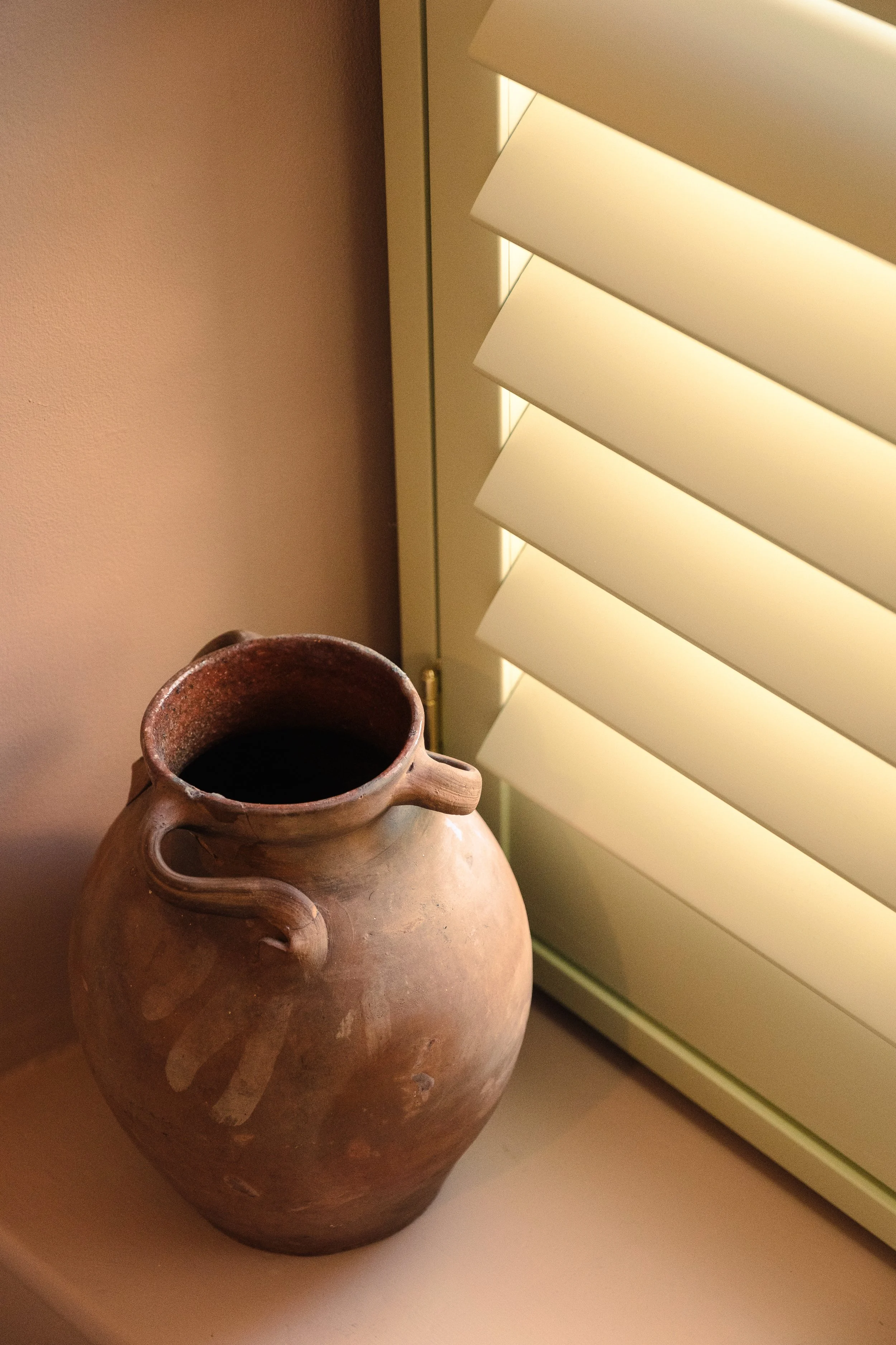
Paint: Filthy Terracotta by The Pickleson Paint Co. | Shutters: Shutterly Fabulous in Filthy Terracotta | Photography: Dom Palmer
When we bought our first home together, we knew we’d have to compromise…
We had spent months looking for a gem along the Jurassic Coast, chasing the dream of sea air and soft, cinematic light. But as it tends to go, the right house, in the right place, at the right price proved elusive.
So we pivoted and looked slightly inland. What we found was a classic Victorian semi-detached house full of character, straddling the border between Somerset, Dorset and Devon. High ceilings, original features, a mature garden, a sense of space we hadn’t expected to afford, and lots of potential. Still close enough to the coast to feel connected to it, but far enough inland to open us up to everything the rolling hills of Somerset have to offer.
The only thing it didn’t have was a view.
At the front, a busy, and frankly ugly, main road, with passers-by at perfect eye level to peep directly into the Living Room. At the back, an industrial estate that had long since given up trying to charm anyone. Not bleak, exactly. But certainly not the rolling, honeyed Somerset landscape you imagine when you say the words out loud.
There’s a well-worn idea in interiors that if you have a beautiful view, you should frame it. Draw attention to it. Celebrate it. But the inverse is rarely discussed. What happens when the view isn’t worth framing?
The answer, we decided, was to shut it out.

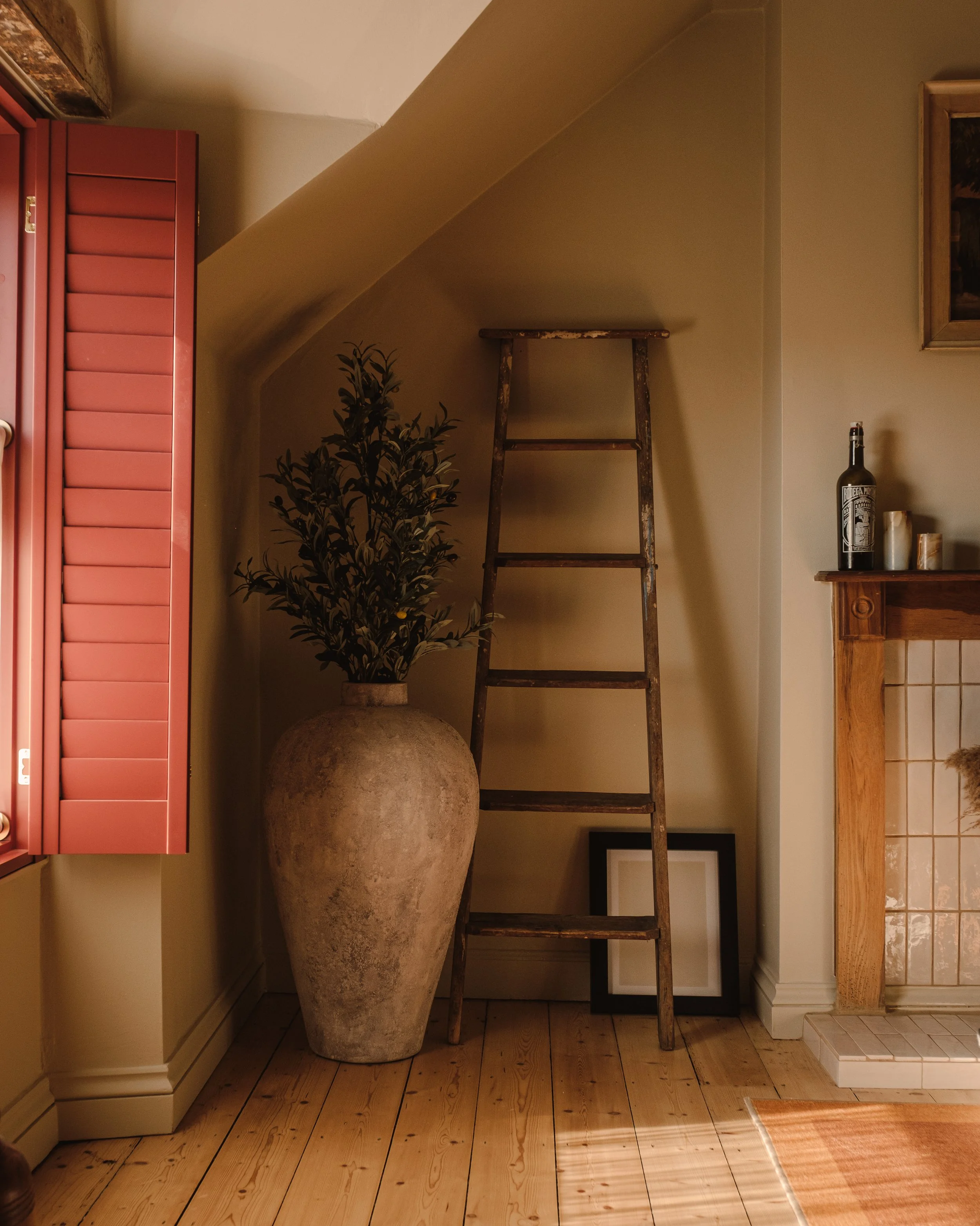
Paint: Le Nozze Stone by The Pickleson Paint Co. | Shutters: Shutterly Fabulous in Filthy Terracotta | Photography: Dom Palmer


What we wanted was control. The ability to retreat. To create a sense of interior life that wasn’t constantly interrupted by whatever happened to be passing by outside. So we landed on shutters.
Shutters don’t just cover a window, they define it. They let you decide how much of the world gets in, and on what terms. Fully closed, they create a kind of quiet, architectural stillness. Slightly open, they filter light in a way that feels luxurious and cinematic. You become aware of the room again. Of texture, of colour, of shadow. Plus, the Italians like them, which is always a good sign.
It seemed obvious to us that if shutters were going to play such a central role in the room, they shouldn’t be treated as an afterthought, they should be chosen carefully. But when we invited companies round to measure up and wow us with their plentiful offerings, we were left disheartened. Shutters, we were told, are white.
White is safe. White won’t date. White won’t cause problems when you redecorate, or when someone else does. You shouldn’t use colour! You couldn’t! You wouldn’t! We paused, considered following suit and going with white, then decided to trust our instincts. With the right shades, chosen thoughtfully, colour could feel just as timeless, and far more interesting.

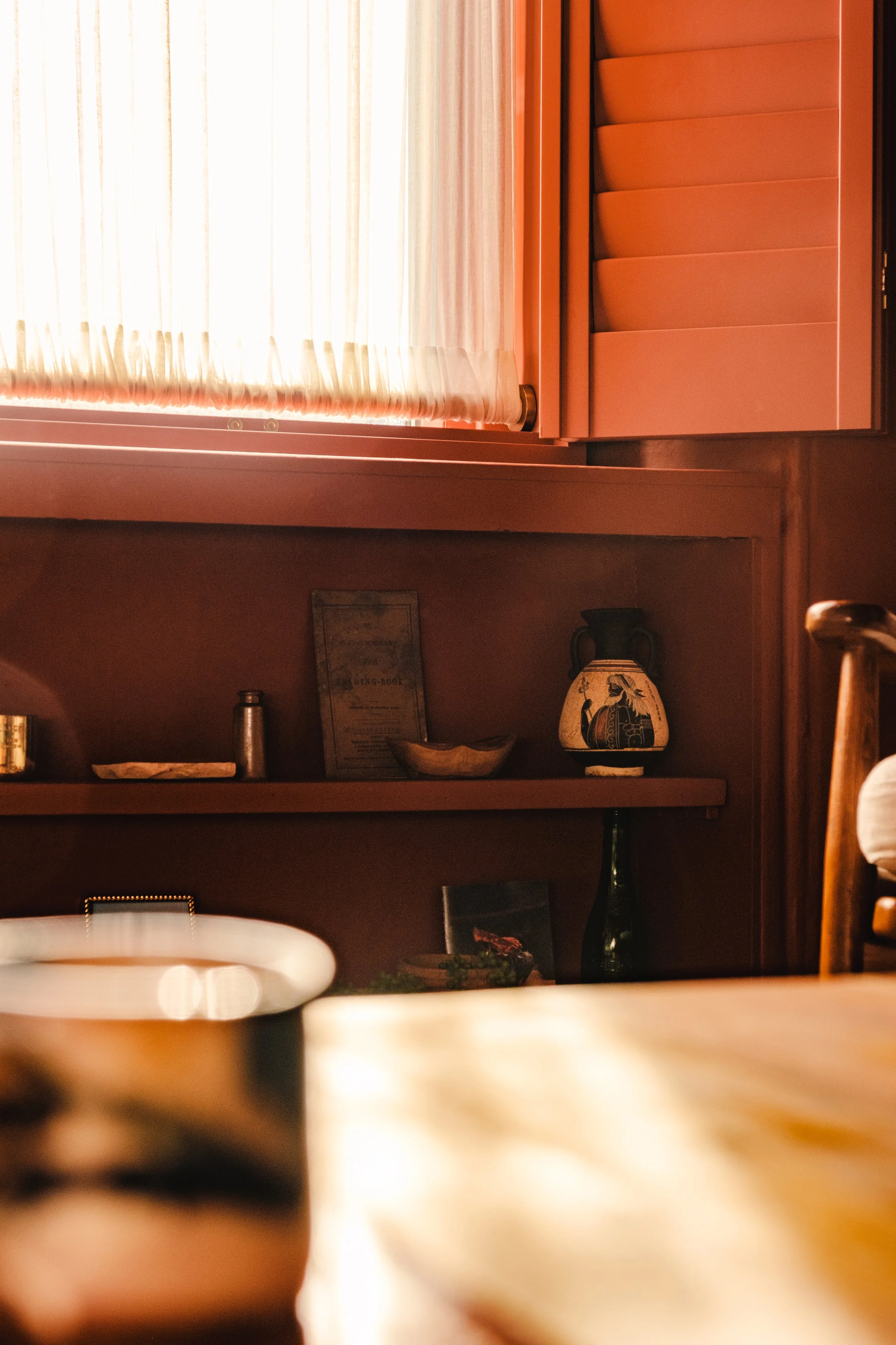

Paint: Aegean Sage by The Pickleson Paint Co. | Shutters: Shutterly Fabulous in Filthy Terracotta | Photography: Dom Palmer
That’s when Shutterly Fabulous entered the chat. Instead of being told what wouldn’t work, we were asked what we were trying to achieve. They understood that shutters didn’t have to disappear into a room; they could help define it. There was a shared sense that these weren’t just functional objects, but an opportunity to do something more considered, more expressive. Something, for lack of a better word, a little more fabulous.
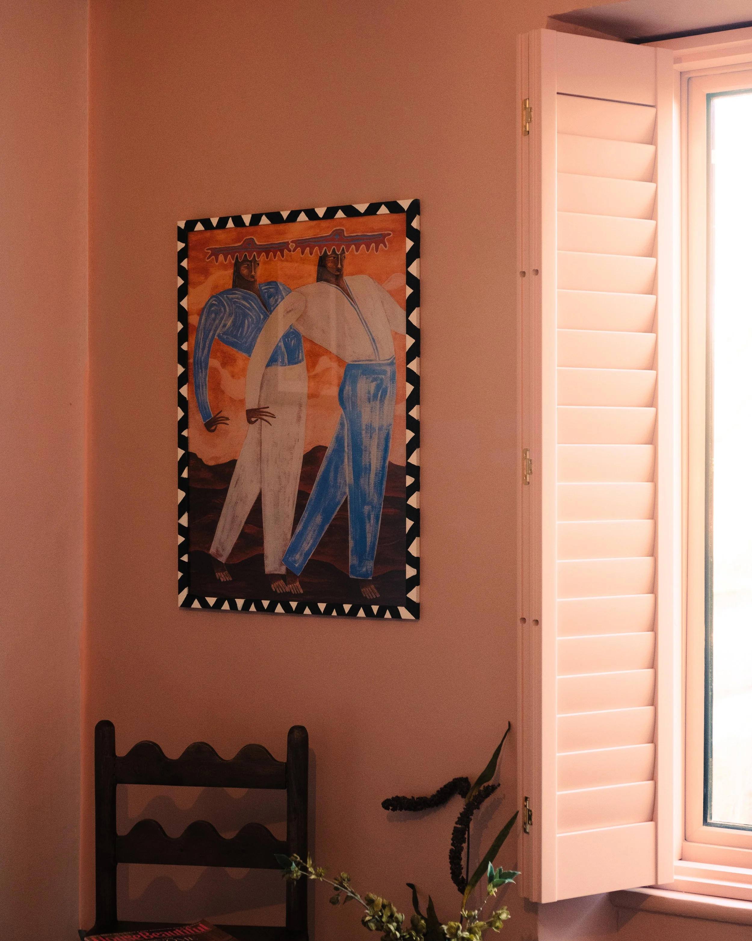
Now, at the front of the house, Filthy Terracotta shutters run across all three floors. The Living Room has been encased in its richness, absolutely drenched. In our main bedroom, we’ve gone floor to ceiling and paired them with Aegean Sage walls to create a decadent Mediterranean-inspired space, and on the top floor the shutters hog the limelight, contrasting with our Le Nozze Stone and a beautifully aged wooden lintel.
Lido Pink fills the Dressing Room, another space we have chosen to drench, this time using our most popular colour, made famous by Matthew Williamson and inspired by the iconic Powder Room at Gleneagles.


In the (as yet unfinished) Breakfast Room, East End Clay will ground the space, which is set to be filled with bold, tobacco-coloured zellige tiles and stained wood panels, bringing us ever closer to our lifetime goal of living in a vermutería.
Aegean Sage café-style shutters grace the landing, framing our only quasi-acceptable view, a classic narrow Victorian garden full of mature trees, vintage roses and hydrangeas. And in The Studio, Borrowed Orange provides a punch of colour in a room we’re filling with dark wood, touches of red marble, black leather and chrome. The brief for this room is “1970s Italian music exec’s office. He smokes like a chimney, talks with his hands and is innately snoggable.” We digress.


What we’ve ended up with is a bold, confident, defining array of shutters that not only work with the rooms in which they sit, but make them. They’re hung like pieces of art, rejecting everything we don’t want from the outside and shining light on everything that’s good about the inside. They’re beautifully built, easy on the touch, modern yet timeless, and give a nod to a Mediterranean aesthetic whilst remaining staunchly British. They even have brass jewellery. Jewellery, for God’s sake!
Since becoming full shutter converts, Pickleson and Shutterly Fabulous have joined forces, and you can now order their signature designs in forty Pickleson colours and counting. They are matched perfectly, allowing you to colour-drench to your heart’s content. You can opt for one of our neutrals to create a gentle upgrade that won’t upset your mother-in-law whilst elevating the ‘just white’ aesthetic. Or you can choose a Pickleson colour you will always love as an accent, a bold design choice that, provided you play your cards right, can become incredibly versatile across multiple schemes over time.
When you open your mind, and in this case your Living Room, to colour, you realise that bold choices aren’t there to provide constraint. They have the ability to be versatile, timeless, uplifting and freeing.
So, if you’re ready to do something a little more interesting with your windows, head to Shutterly Fabulous, book your free consultation, and ask them about Pickleson colours.

Paint: Filthy Terracotta by The Pickleson Paint Co. | Shutters: Shutterly Fabulous in Filthy Terracotta | Photography: Dom Palmer