Colour of the Year
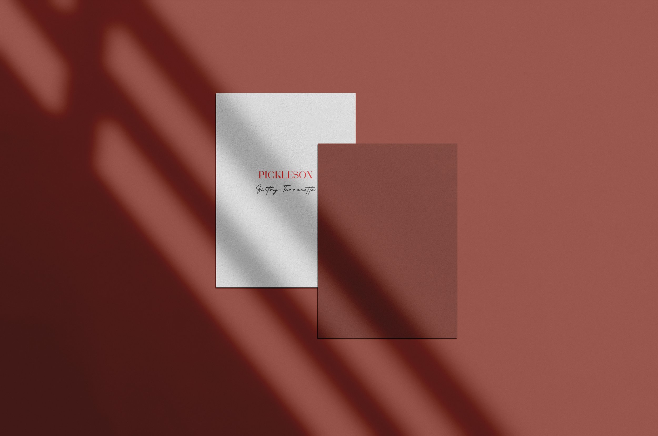
INTRODUCING PICKLESON’S COLOUR OF THE YEAR 2026, FILTHY TERRACOTTA
FILTHY TERRACOTTA IS ONE OF THOSE COLOURS…
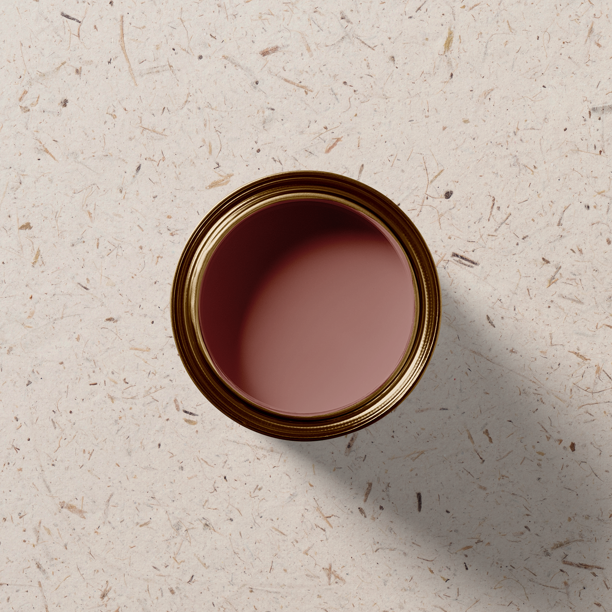
…That has been criminally underused since we launched it as part of our original range in 2020. Its deep, rich, sometimes-red-sometimes-brown appearance can strike fear into even the bravest of souls and, as a result, has perhaps fallen victim to it’s own beauty, as people wrestle with the idea of a room becoming too dark, too enveloping, too ‘filthy’.
When Rachael and I moved into our first home together in February, we had planned to showcase how people might go about using our bold but balanced range in their homes and we were convinced we’d ease in with a warm neutral gracing the walls of our Living Room. So, the samples went up… East End Clay, Lyme Stone, Drunk Tahini, Porto Cream. Lovely as they were, none of them hit quite right in the space. Perplexed, we sifted through the rest of our range and - as it tends to do - Filthy Terracotta stood out. We placed it above the mantlepiece and all other contenders instantly fell away. It was colour drench the Living Room in Filthy Terracotta or nothing!
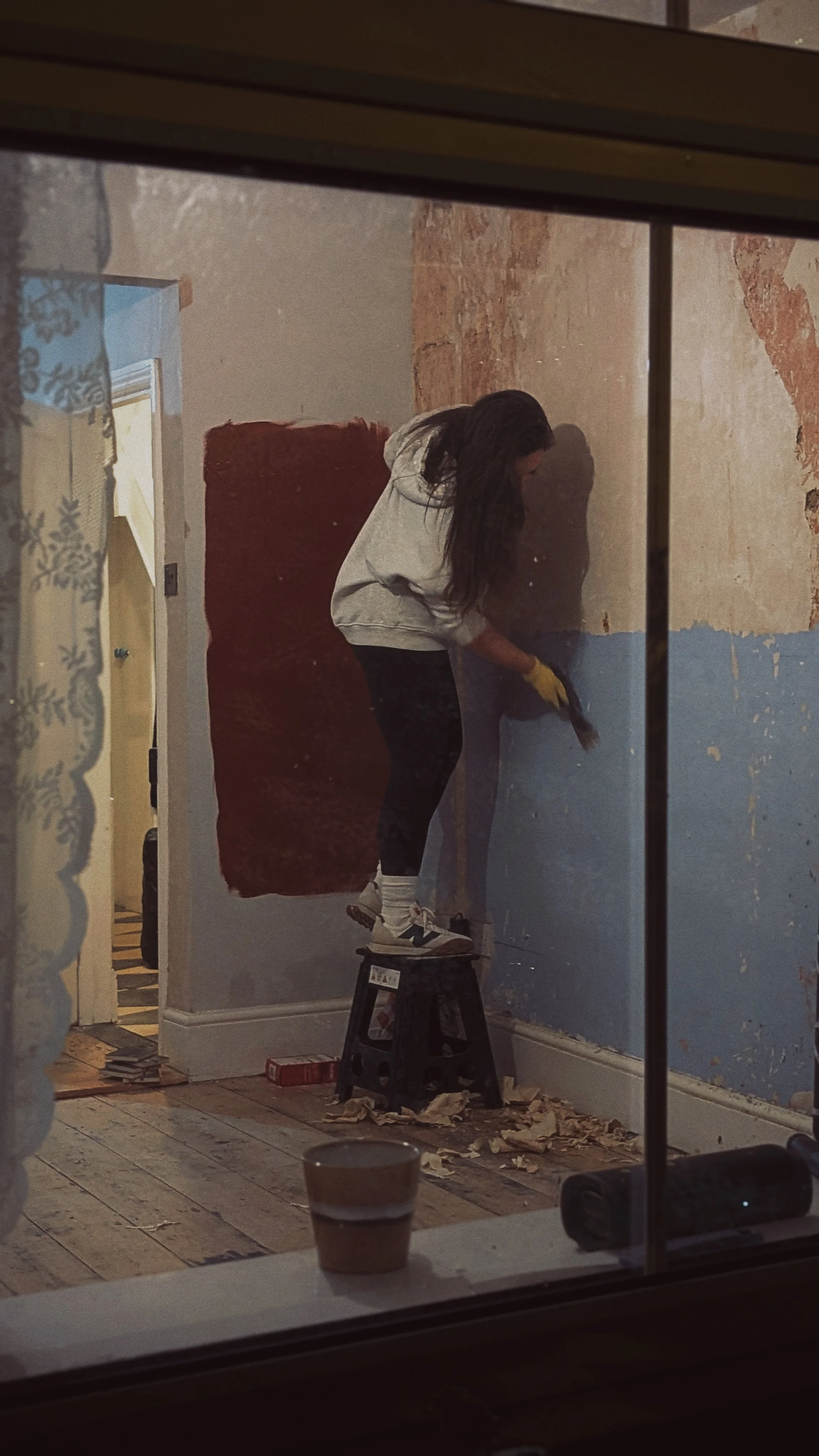


It’s fair to say that Big Lyndy (Alex’s Mum) didn’t instantly approve. The gasp she gusp when first entering the room after the paint job, reverberated around the hills of Somerset and neighbouring counties. However, much like Filthy Terracotta, she does have a penchant for the dramatic. Once fully settled and accompanied by furniture, artwork, greenery and too many terracotta pots, Filthy Terracotta became beautifully enveloping. It was warm and welcoming and sophisticated and transformative. A bold choice, but in this case, the right one.
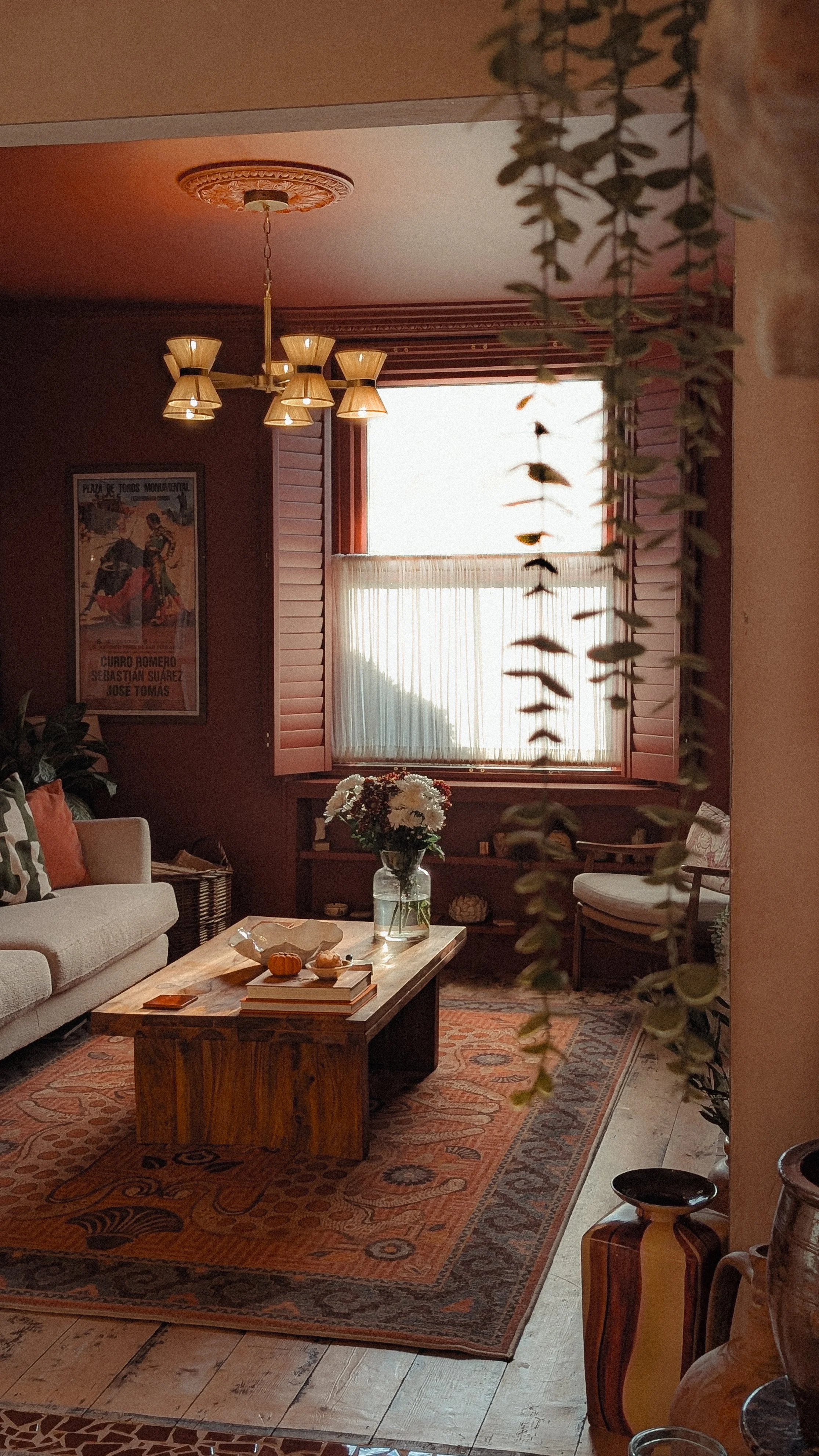

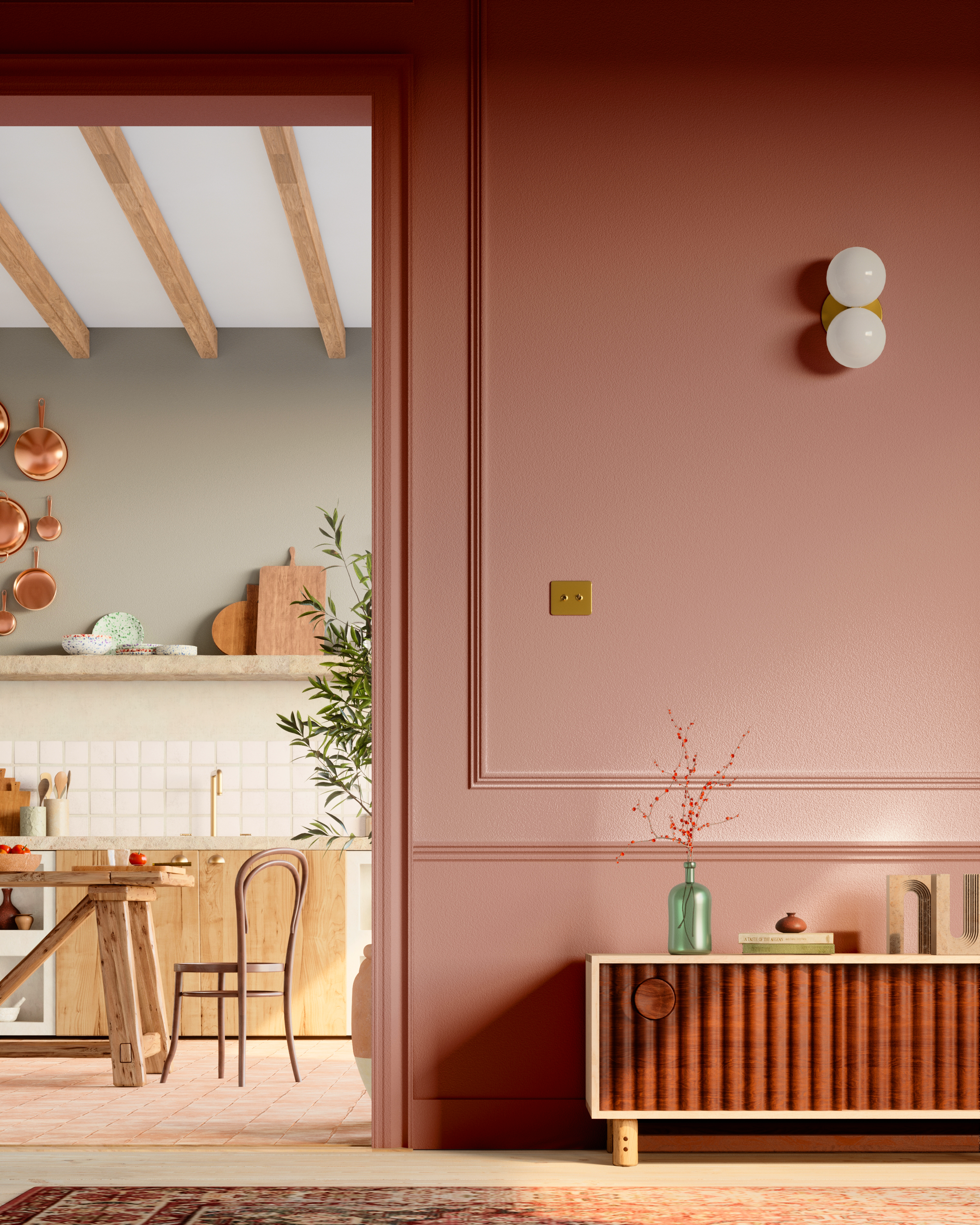
Paint: Filthy Terracotta by The Pickleson Paint Co. | Rug: Ruggable | Shutters: Shutterly Fabulous
So, looking ahead to 2026 and the inevitable question… Did you just choose Filthy Terracotta as your colour of the year just because you painted your Living Room in it? Partly, yes. But it has also been chosen on the basis that we see the year ahead being one that will allow for bold colour choices, whilst remaining sophisticated.
Bravery in design doesn’t necessarily have to mean throwing bright pinks around and endless clashing patterns and and ethos of ‘maximalist or die’ (although we maintain there is absolutely still space for that). It means picking the colour that is right for your room and right for you. If that’s a classic warm neutral, so be it. But if it’s a brutal, lip-smacking, all-consuming terracotta then please - by all means - be our guest.

Paint: Filthy Terracotta and East End Clay by The Pickleson Paint Co. | Photograhy: Liam Baldock
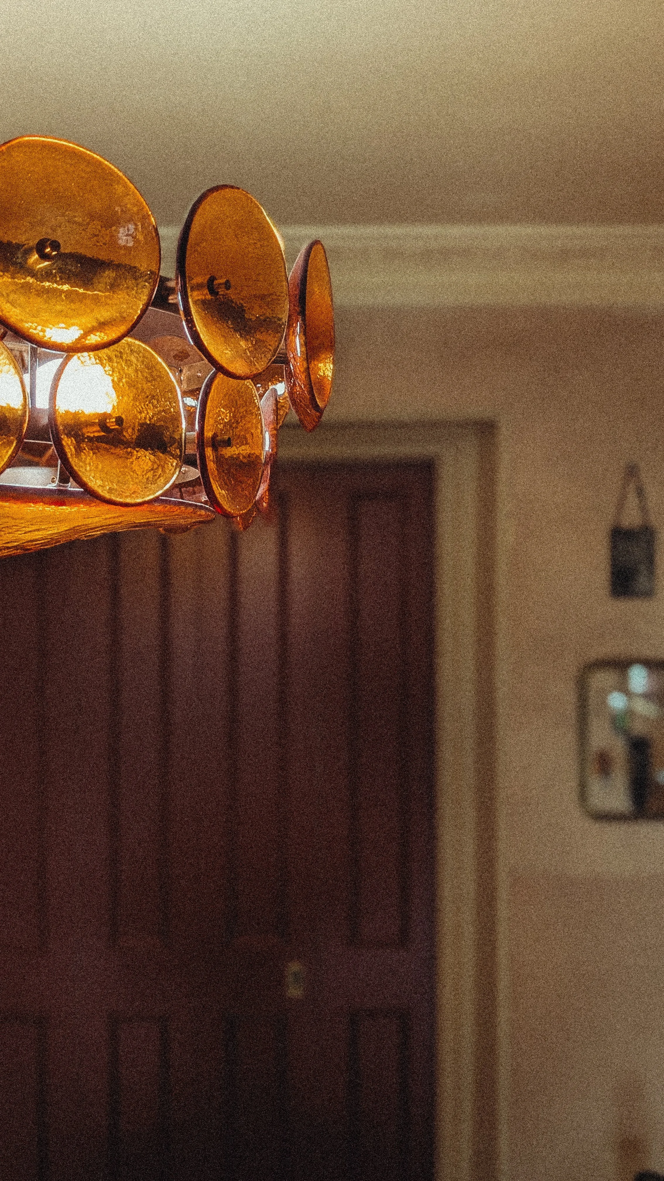


Paint: Filthy Terracotta by The Pickleson Paint Co. | Ceiling Light: Soho Home | Cushion: Peaceable Kingdom | Shutters: Shutterly Fabulous | Sockets: Bromleighs
As for ‘Colour of the Year‘ as a concept in general. We have to admit, we don’t reeeeally get it. We believe you should use the colours in your home that work with the space and make you feel good, always. However, we foolishly posted a poll on Instagram asking if people would like a Pickleson COTY 2026 and the response was (almost) unanimously ‘yes’. So here we are.
Scepticism aside for a moment, we have found Filthy Terracotta to be truly transformational in our home. Our Living Room suffers from a lack of natural light, is at times overwhelmed by the noise created by the main road it sits on, struggles for privacy and is an absolute pig to photograph! It’s a room that gave us a lot of headaches, but with the addition of Filthy Terracotta, some wonderful matching shutters, brass accents, layered textiles and considered lighting, we have found ourselves with a deeply comfortable, cocooning space in which we can truly relax. It elevates artwork and emboldens natural materials. It is a brave choice and gives you the freedom to be braver still with your other design choices. It’s deceptively versatile, pairing beautifully with everything from blushing neutrals to muddy olive greens. It feels North African in the summer and festive in the winter. It really is rather gorgeous.
So, ignore what everyone else has told you about next year’s COTY being a chocolate brown or a charcoal grey or a deep teal or fucking TWELVE different colours and listen to us instead. Filthy Terracotta is your guy. You heard it here first.